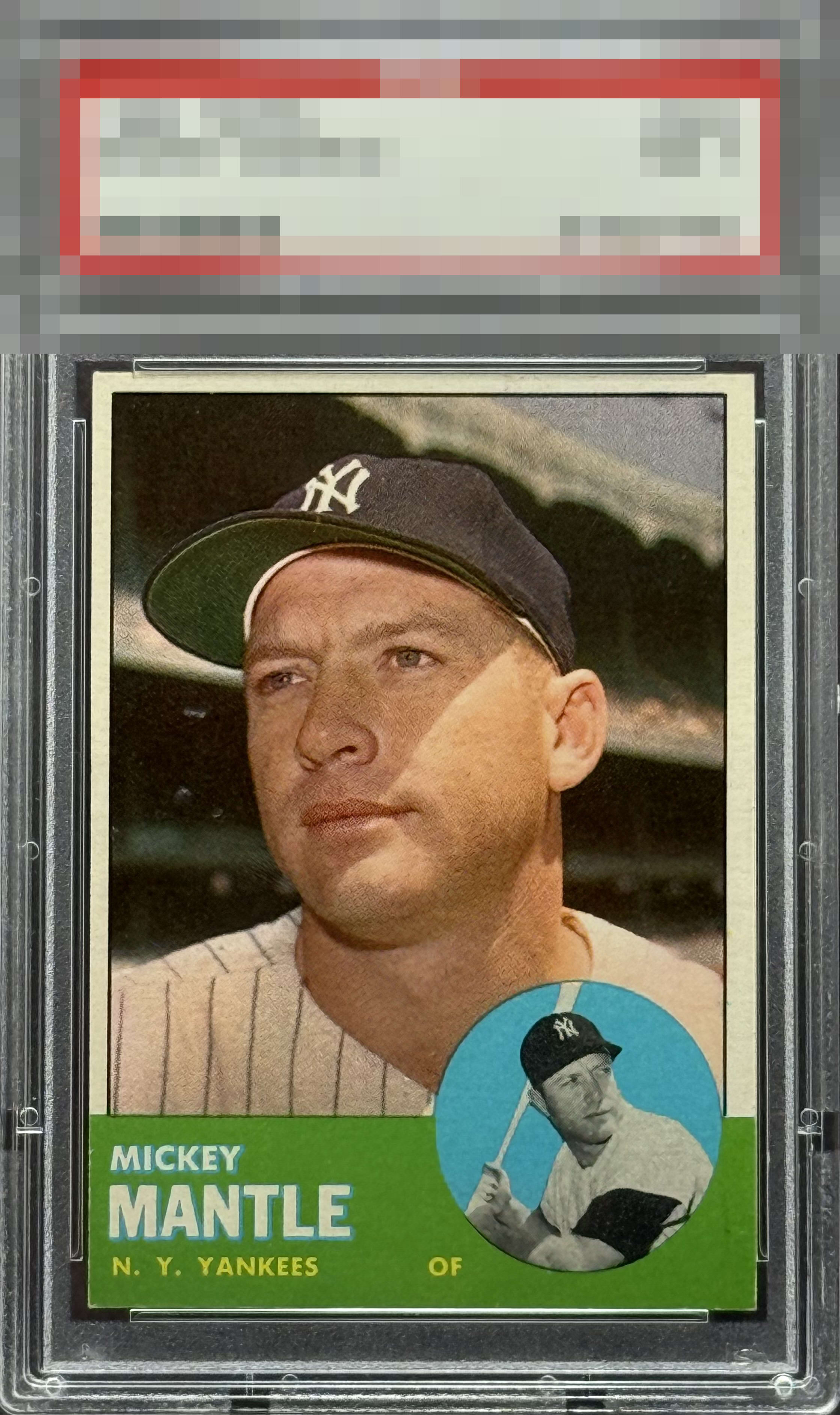
1963 Topps Mickey Mantle #200

Reviews & Discussions
12 total reviews


The centering is kind of a bummer here, but on the flip side I'm impressed with the cleanness of green corners and edges.


It's just the centering here that detracts from the visual appeal; being a centering guy that weighs a lot for me. I have handled hundreds of 63T Micks and this specimen has no print dots in the green and blue, which so many suffer from.

Overall, the print registration is strong, particularly in the lower portion where the green presents sharply. The text is well-aligned and crisp, and the secondary player image stands out nicely against the teal background. The primary player image is excellent, but the noticeable off-centering ultimately keeps this card from reaching an A tier.

Crisp image, colored areas have no PD. Just a strong leftward centering shift.


centering is off to me and noticeable. Slight black smudge in bottom right in green banner. Nice edge and corners and image is sharp
EyeQ+
EYEQ+ TROPHY CASE

Rating Distribution
12 total reviews
Off left to right.