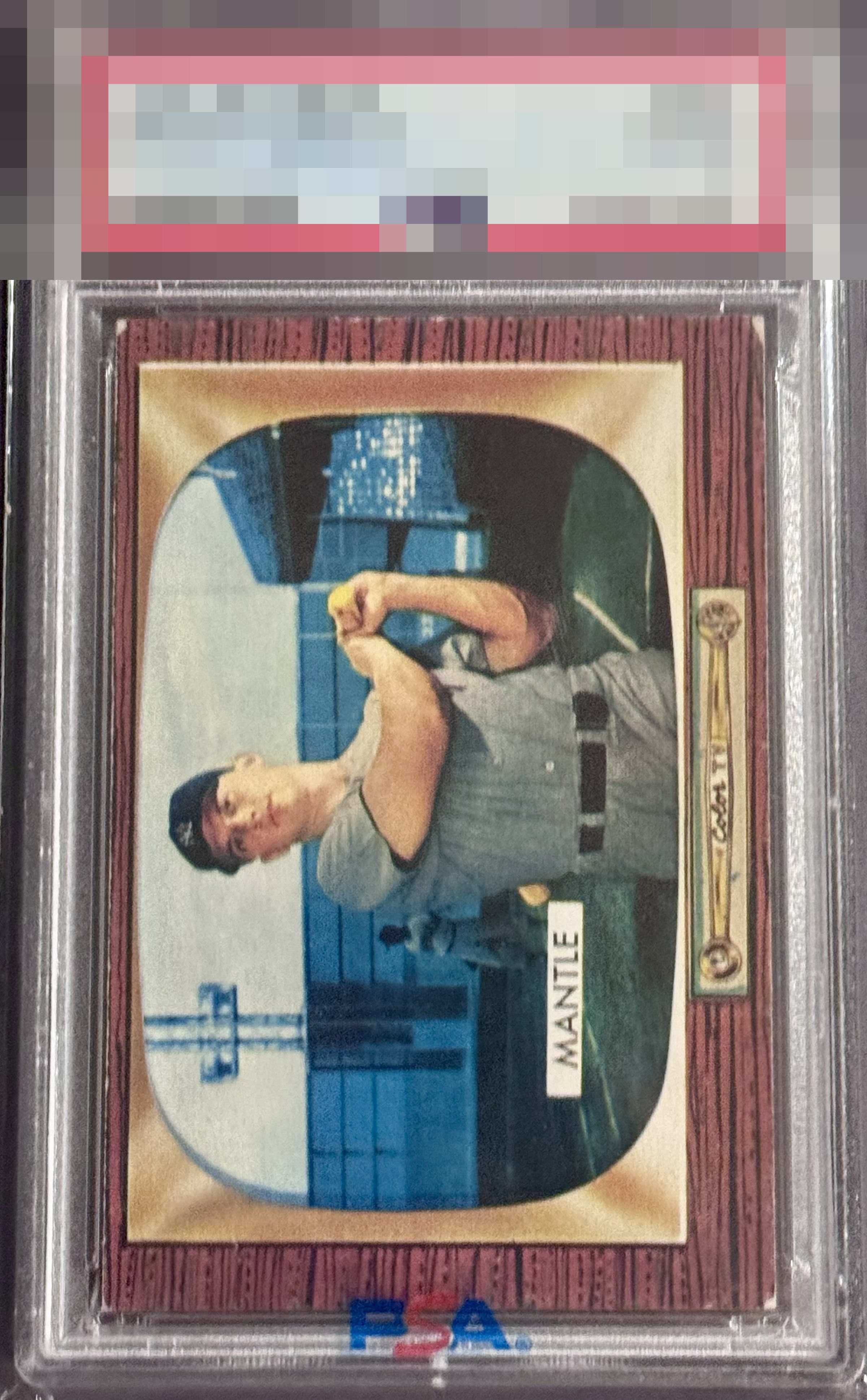
1955 Bowman Mickey Mantle #202
1 / 2
Click to enlarge
💬
Reviews & Discussions
7 total reviews

The corners aren't in great shape, but Mantle looks good. It's solid.


Difficult year with the wood grain to combat corner touches. Slight shift on an otherwise pretty image of the Yankee legend. Fun way to represent the era. Neat card


to much border, edge and corner damage for my liking. Adds up and distracts. The image itself is good

Good eye appeal. The white corner wear makes greatest impact. Edges, centering, image all solidly in the B zone. The numerical system likely says 2-3 out of 10 but I see much better looks here.
Locked

0 reviews
EyeQ+
136.0
Global Population
5
POPULATION ACROSS ALL GRADES AND GRADING COMPANIES
Global Eye Rank
#2
Population in Grade
1
POPULATION IN THIS GRADE AND GRADING COMPANY
Eye Rank in Grade
#1
EYEQ+ TROPHY CASE
2nd Place
GLOBAL

1st Place
IN-GRADE
📊
Rating Distribution
7 total reviews
G
0%
A+
0%
A
0%
A-
0%
B+
0%
B
4 ratings
57%
4
B-
2 ratings
29%
2
C+
1 rating
14%
1
C
0%
C-
0%
D+
0%
D
0%
D-
0%
F
0%
Great focus and centering lift the eye appeal on this Mick. Three of the corners are worn enough on this super sensitive design that overall eye appeal lands in the good tier despite those great aspects.