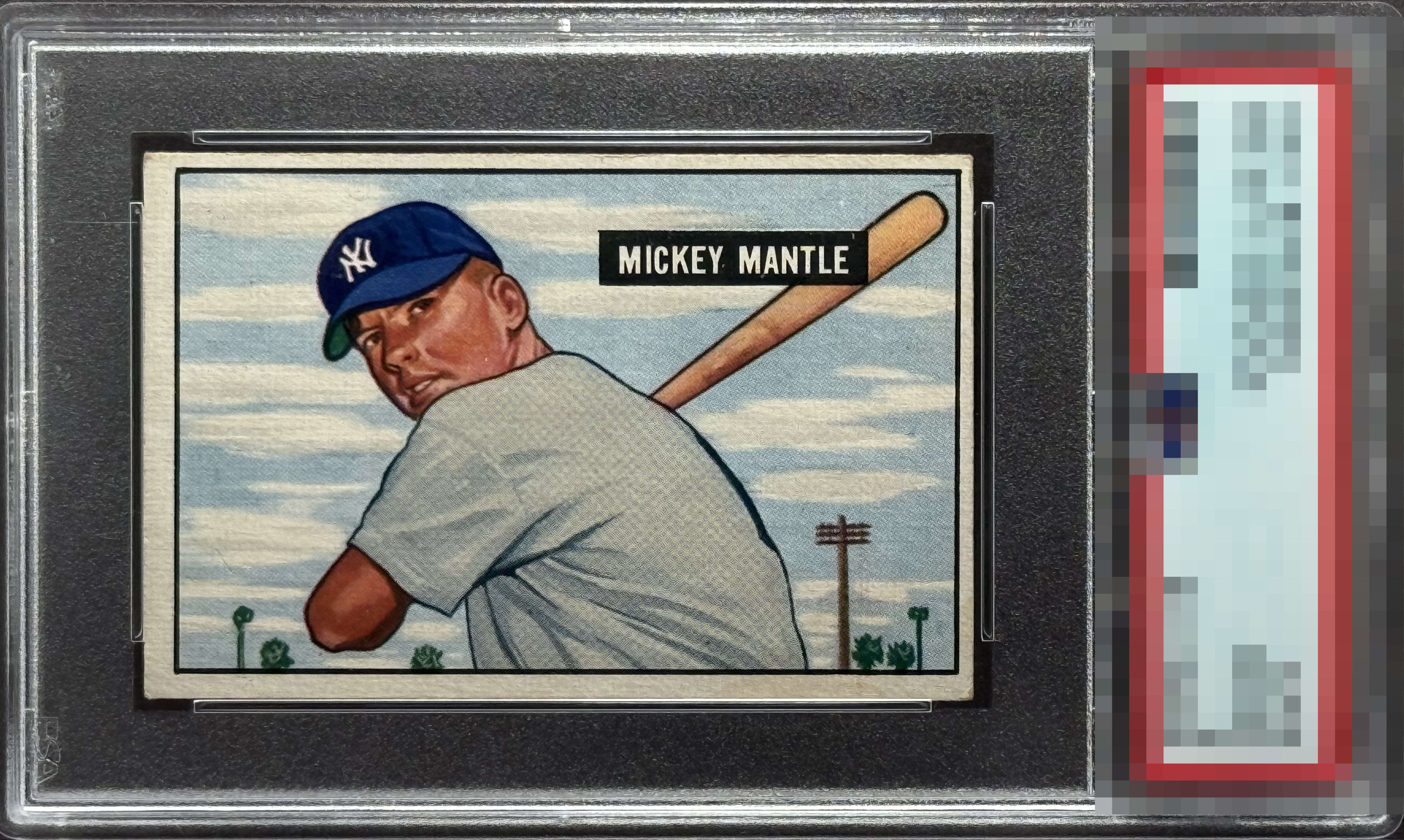
1951 Bowman Mickey Mantle #253

Reviews & Discussions
13 total reviews

Beautiful card. Centering isn’t great but the colors and sharpness of the image are stellar.

Hard to get past the centering for me but a clean example of an iconic card.

Centering is really the only issue here. Corners are relatively great. Registration of the card is superb. Better than a '2' for sure.

The centering nukes it for me. The surface, color and registration are awesome, however.

The quality of the image here, the registration, carries it all the way up to B+ even with the off centering. And this is from a centering guy. Super.

This card punches well above its weight class. Centering shift is the issue. The image is registered perfectly and that focused cap logo draw the eye right to it.

Fantastic color and registration but the centering shift is a bit too severe for me to award a higher score. That said, punches well above the technical grade from any eye appeal standpoint.

nice looking card but dark from the discoloration and the centering is off and the borders are decent but not appealing

Color and registration are amazing but off center brings it to a lower grade. Grade card for the 2.
EyeQ+
EYEQ+ TROPHY CASE

Rating Distribution
13 total reviews
Off centered.