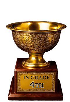
1951 Bowman Mickey Mantle #253

Reviews & Discussions
11 total reviews

Centering is pretty good and the color/image is great. Staining on the back is minor. My eye does immediately notice some wear with the corners and some “debris” on his back/shoulder. Overall the card has good eye appeal to me.

Love the image here and centering is the only flaw that jumps at me. Minor PD I can shrug off.

With a 1951 Bowman you have three big issues, print roller lines, centering and focus. This is ultra elite on two of the three. Only a little top bottom centering holds it back from a higher score.


My eye immediately goes to the centering, and the face and hat also look a bit blurry to me.

Mantle's image the the color look nice but top to bottom centering and surface issues bring the grade down.

Great copy centered high and the dirt on his shoulder. But a nice card anyway.

nice centering but not its best. And the marks on his back hold it down. The top border/corner is noticeable in its discoloring Over Nice colors and good image

I know this card so very well, have seen or held so many over the decades. This is a high eye appeal mark for me on a 51B Mick. Top centering is the main culprit here. The vast majority are in the C-zone due to centering and/or registration. Then there are the print lines.
EyeQ+
EYEQ+ TROPHY CASE

Rating Distribution
11 total reviews
Eye appeal remains relatively high as it really starts with The Mick himself, and here the image is focused. I like the clean black name box as well. Centering and faint marks here and there are the prime flaws yet the overall presentation to my eye is top of the second tier.