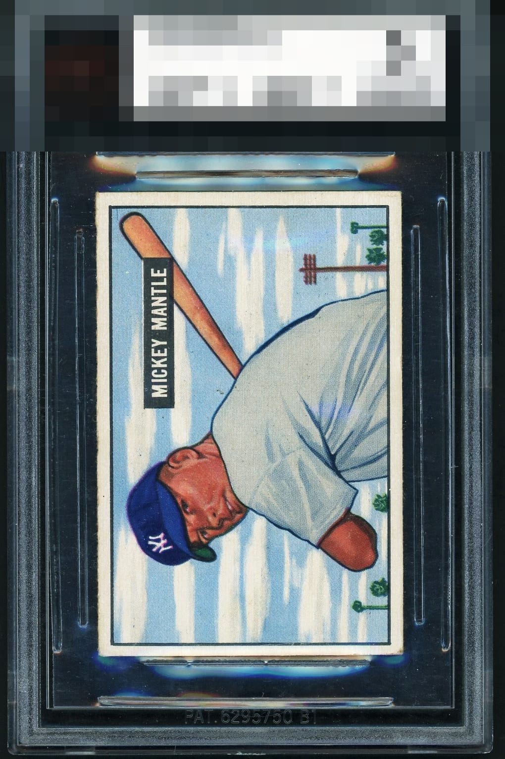
1951 Bowman Mickey Mantle #253

Reviews & Discussions
10 total reviews


Neither the registration nor centering are spot on but both are well above average. Very clean and relatively sharp.

Beautiful copy! The image and colors are nice and crisp and the centering, while not perfect, is very solid. Solid eye appeal grade for me.

The image looks nice and focused, nice color as well. Centering is a little off left to right, but this is centered much better than most. Clean surface with just a few stray print marks. Beautiful card!

Top Tier eye appeal is rare for this card. This has it. Centering is really the only area for improvement. Hard to find better than this example.


have how bright and clean the borders are and how solid the image and colors are. The centering is off that holds it back from greatness

Very close to A+. Leftward centering and a very mild registration shift (note the NYY cap logo when comparing to some other examples) are the only dampening factors.

What a pretty example of one my favorite baseball cards of all time. Top Tier eye appeal in my opinion. The top/bottom centering is perfect and the flaws are very gentle on the eye.

EyeQ+
EYEQ+ TROPHY CASE

Rating Distribution
10 total reviews
One of the best versions of this card. Only item taking it out of god tier is the tiny bit of off centering but this version is better centered than 99 percent of copies. I’ve been looking for this card and if I found this in the wild, it would be my version.