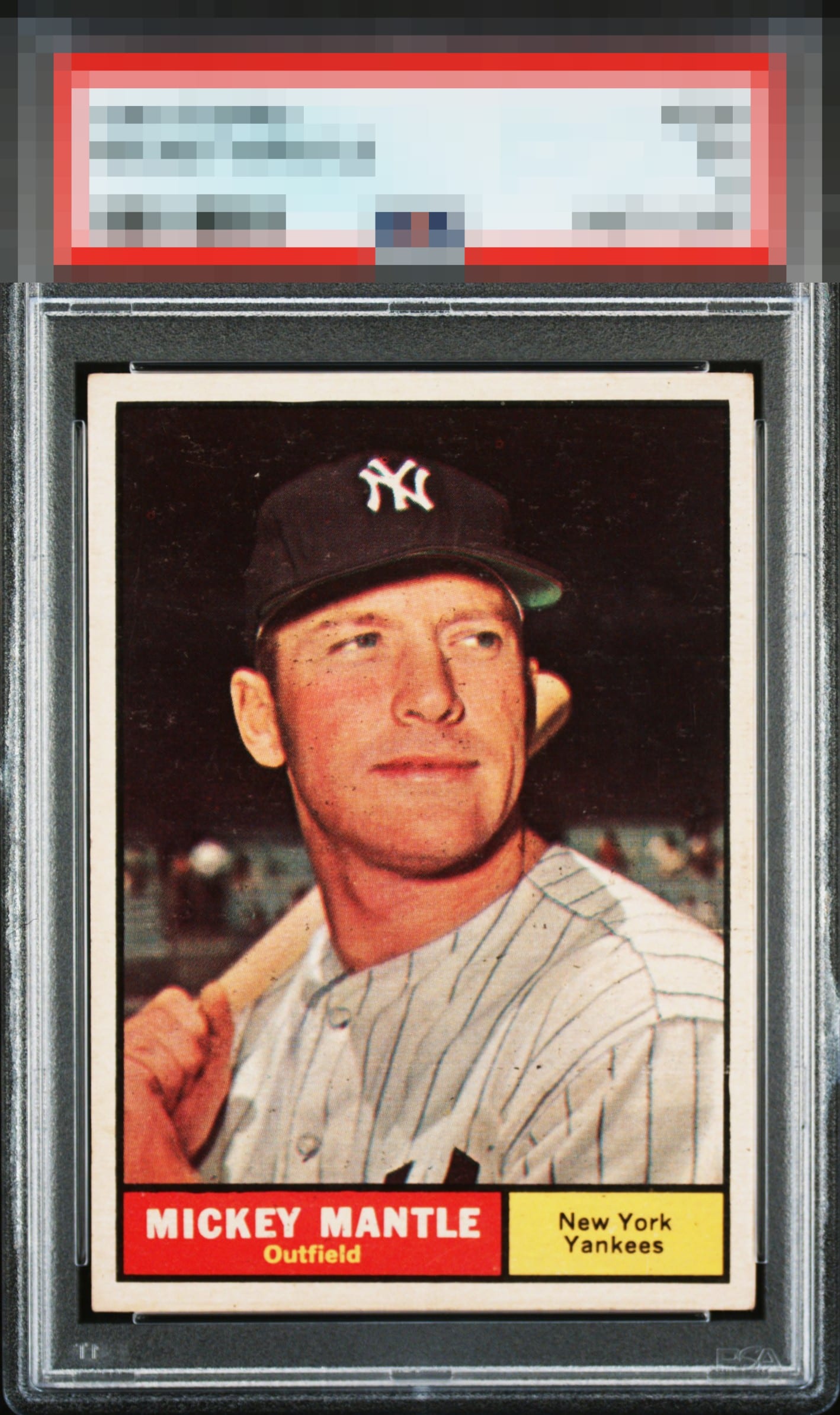
1961 Topps Mickey Mantle #300
1 / 2

💬
Reviews & Discussions
7 total reviews


You just don't see centering on this card as good as this often. My only note is on the surface, which holds it back from an even higher grade for me.

The centering is much better than most, almost perfect. Some stray black dot print defects on his face and jersey and snow in the background are the only issues.

Really like how bright and clean the card looks. The borders are big and bold and the center is good (but has some opportunity)

Love the colors. The centering does have a very subtle tilt. The dark specks on the face and uniform does detract.

Centering and beefy borders boost the eye appeal. Stray black print and focus factor in. Overall remains top echelon.
Locked

0 reviews
EyeQ+
126.0
Global Population
7
POPULATION ACROSS ALL GRADES AND GRADING COMPANIES
Global Eye Rank
#6
Population in Grade
1
POPULATION IN THIS GRADE ACROSS ALL GRADING COMPANIES
Eye Rank in Grade
#1
EYEQ+ TROPHY CASE

6th Place
GLOBAL

1st Place
IN-GRADE
📊
Rating Distribution
7 total reviews
G
0%
A+
1 rating
14%
1
A
1 rating
14%
1
A-
3 ratings
43%
3
B+
2 ratings
29%
2
B
0%
B-
0%
C+
0%
C
0%
C-
0%
D+
0%
D
0%
D-
0%
F
0%
A tale of 2 sides of a card