1952 Topps Mickey Mantle #311
Reviews & Discussions
16 total reviews


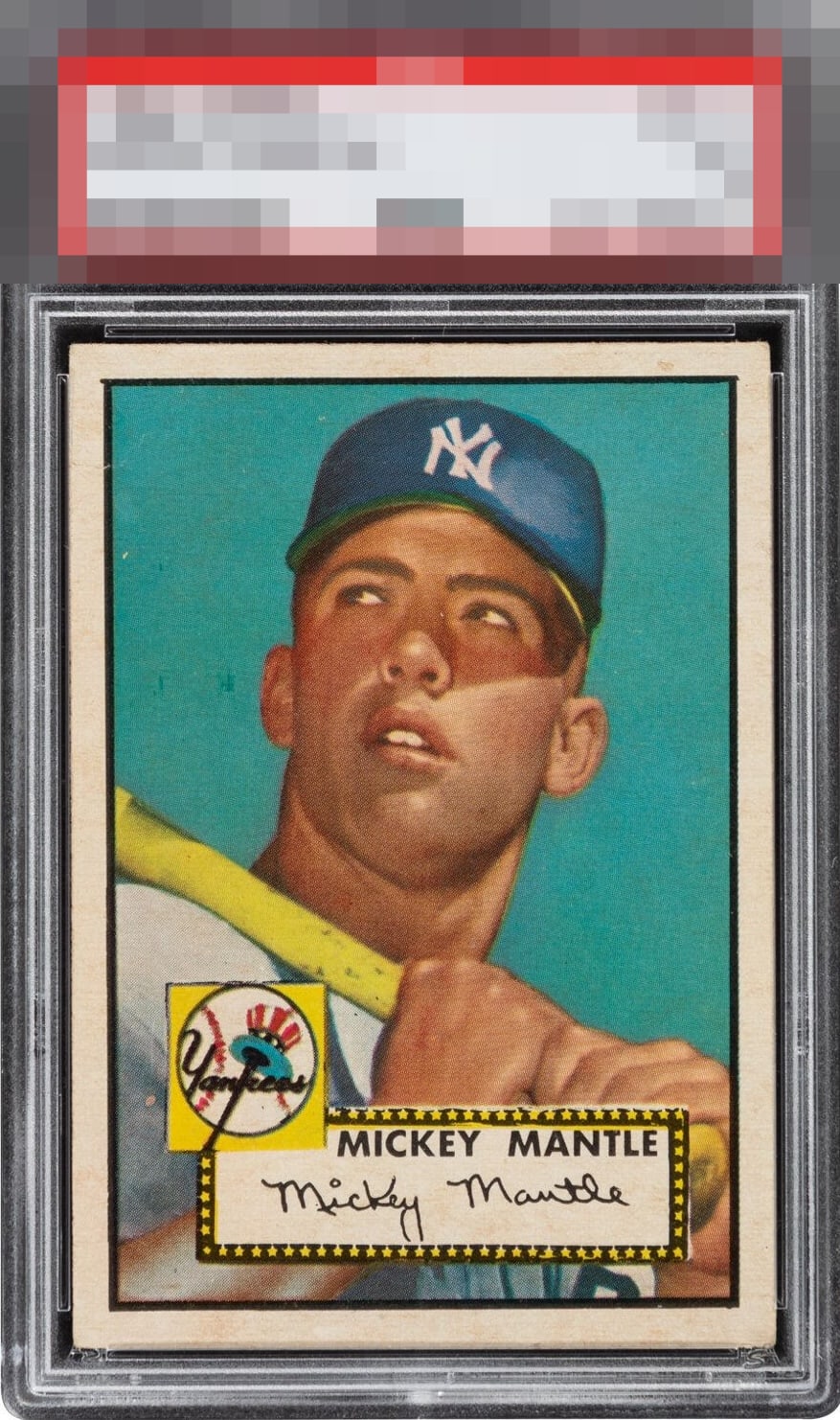
Beaut… Dark blue background stands out along with flawless centering. One speck to the left of Mick’s face, but I can’t ignore how poorly this was graded.. GOD tier given the differential.

This centering is top .0001% for this card, plus even the corners look really good. I see that small wrinkle that affects the grade, and also see that mark by his ear. Those things do not matter to my eye. The overall presentation is among the best for this card that I have seen.

Crease in the upper left and a few minor print spots keep this from God Tier, but it's close. Insane card!

Beautiful card overall. Too many small marks and blemishes hold it down from GT status.

Presents WAY above it's technical grade. The color and centering are elite. The "flaws" just disappear the more you look at it. This is a dream '52.

I had to stop my scrolling and stare at this longer than I ever have for a 52T 311. This is jaw dropping. That sky looks like it was painted last year and hid in a dark room. The centering doesn't exist outside a baker's dozen across all grades. Words limit me here. Wow. Just wow.


This hits like an asteroid of eye appeal. I can see there is a mild wrinkle across a back corner which causes the 3rd Party Grade. I could not possibly care less. Or, perhaps I should say I'd actually LOVE that wrinkle as it would bring the price way down, while I get to look at a card that looks better than off centered 7s and 8s from the front ;)
EyeQ+

EYEQ+ TROPHY CASE


Rating Distribution
16 total reviews
One of the best copies for the grade in the world, love this card.