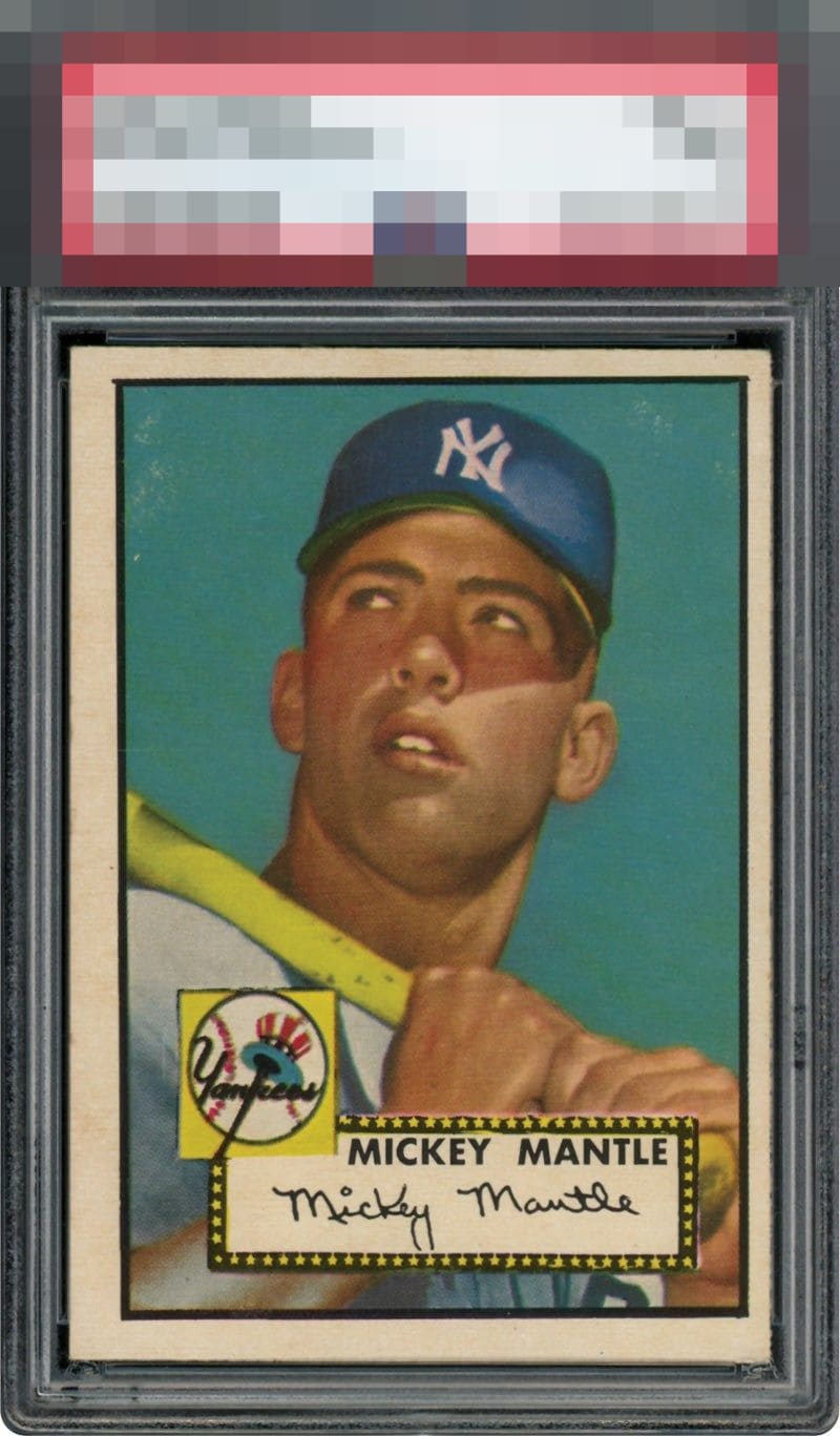
1952 Topps Mickey Mantle #311
Reviews & Discussions
12 total reviews

Tilt seems to adversely affect eye appeal even more than sub-optimal centering. Unfortunately this card suffers from both aesthetic flaws. Scanning the surface, I detect breaks in the blue background, which further decrease the eye appeal.

Given the premium this card holds relative to cards that really oughta be held in equal esteem, it feels fair to have high expectations. This is a pretty card with lovely color. The centering, tilt and surface flaws leave a good bit to be desired.

Centering and tilt hurt the eye appeal as do the marks in the blue background.

Has to be a B- at best to me, given this level of centering and tilt. The abrasions in the blue knock the eye appeal down one more rung.

The tilt and the white scuffs or blemishes in the aqua background really do hurt the eye appeal. Because Mantle's image is clean points are saved.

Great color and main image but can't get past the centering and stains towards the top.


Centering is poor. Tilted, too. And I am not sure what those white blotches are that mar the all-so-important blue background on the card. Kind of a textbook lower C to my eye.
EyeQ+
EYEQ+ TROPHY CASE


Rating Distribution
12 total reviews
Nice image with excellent color. The card is off-centered and has surface wear in the background.