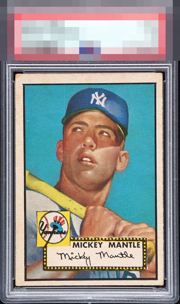
1952 Topps Mickey Mantle #311

Reviews & Discussions
14 total reviews


Even though the centering isn't perfect, it's very nice for this card. Love the color, the only other blemish is the top left corner

This is +centering for a 52T Mick and it's easy to underappreciate the card, getting lost in all of the god tier examples on this site. Fantastic blue, but a vertical print line and one corner issue hold this down


Leaned higher into the B- range here given the picture does pop and is clear. But the centering and some border discoloration made me question a lower score.

Punches well above its weight class due to elite blue background; it's immaculate and bold. Really pleases the eye, so much so that even a centering guy like me stays fixed to that central image and blue color.

the back looks better than the front and centering is off but not bad. The top corner and the discoloration on the borders is the biggest opportunity

A card any collector would love to own. This example has a great surface and bold color. The centering shift to the bottom and a slight tilt are the things that hold it back from a higher rating for me.
EyeQ+
EYEQ+ TROPHY CASE

Rating Distribution
14 total reviews
Great color, centering off.