1952 Topps Mickey Mantle #311

Reviews & Discussions
13 total reviews

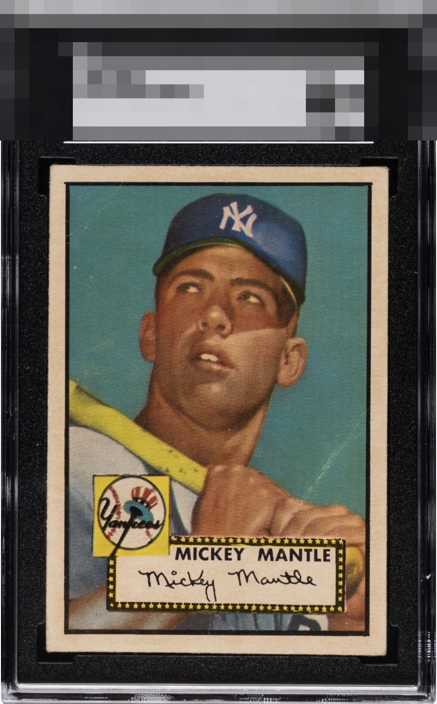
Aside from the crease, this presents incredibly well, that kept it out of A tier for me, but could be argued that this one could sneak in based on all its other attributes


Without that crease this is one of the better looking Mantles out there.

Incredible copy if you can get past the qualifier. Only item taking it out of god tier is the mark/crease above his hands.

If that white crease was just a tad fainter, this is a '52T Mantle with A level eye appeal. These are not getting great eye appeal reactions from collectors because the centering is almost ALWAYS POOR. But not on this one! The aqua is pretty strong except for where the crease breaks it.

Bordering on Got Tier level. That white crease/mark above the hands held it back. But Wow. This is the Perfect Eye Appeal Example. The Bold borders and amazing Centering and the Strong image and colors place this well above the Slabbed Grade. This is a True Keeper in anyones collection

Centered Mantles are my personal favorite so I'm well aware of how hard they are to find. This looks perfectly centered and the blue background looks great as well. The crease and border toning bring the grade down slightly.

Pleasure to view one of these centered like this. The white crease makes me waffle between A and A- but its location and the centering win me over.

Really elite centering here. I catalogued well over 500 examples recently and only 16 were centered like this. The A tier of eye appeal for a 1952 Topps Mantle is, to me, a rare and special thing. The diagonal white crease is serendipitously placed, and is the only aspect that adversely affects the eye appeal on this card. The wear in the top left quadrant does not faze me.
EyeQ+
EYEQ+ TROPHY CASE


Rating Distribution
13 total reviews
Amazing card, especially for the grade. Other than the crease, it looks perfect.