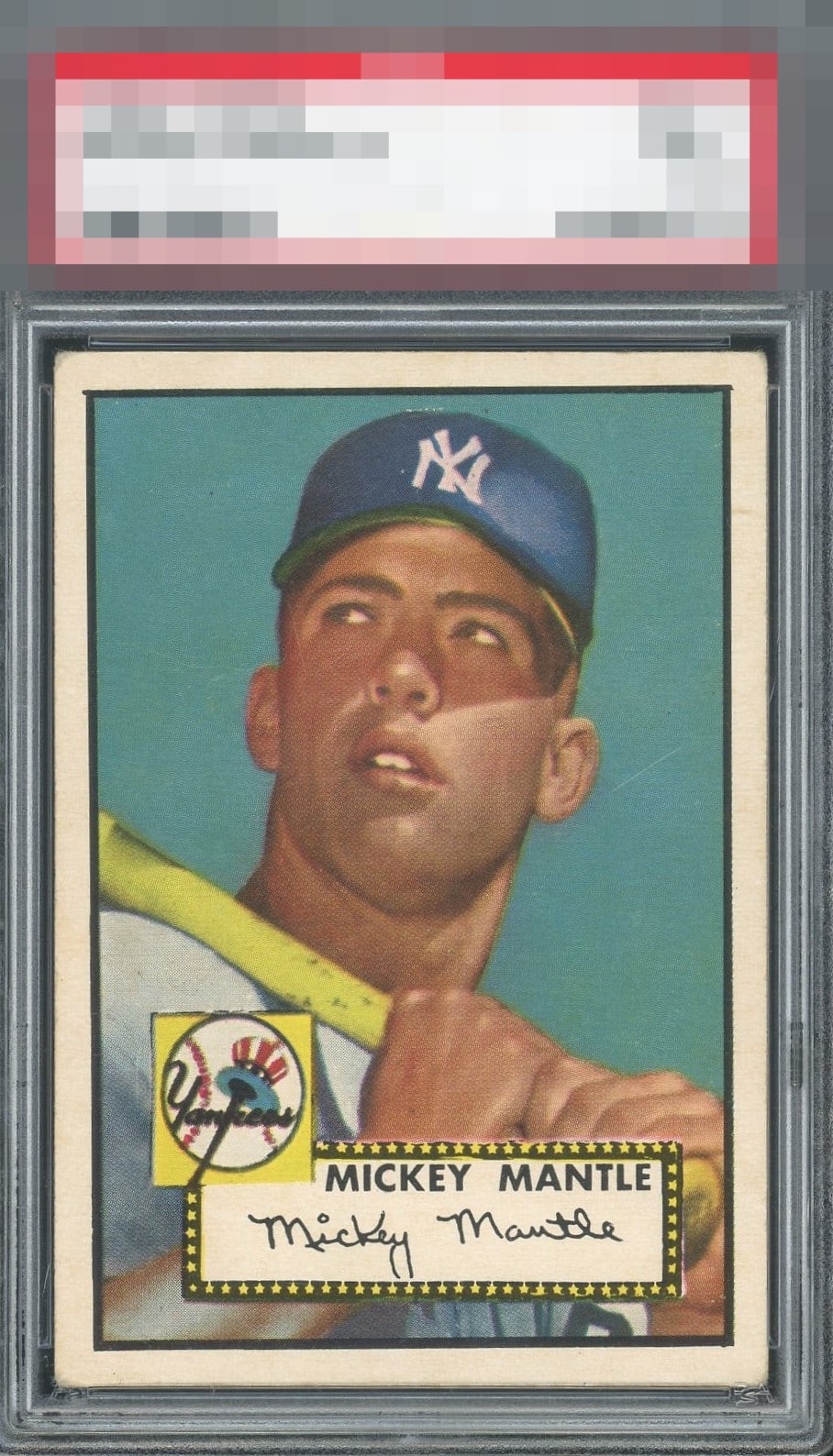
1952 Topps Mickey Mantle #311

Reviews & Discussions
12 total reviews

Stunning. Give me this over many in much higher grade holders. Good luck finding much better centered examples. A true grail.

Slight tilt but otherwise remarkable copy of the institution's greatest example of The Mick.

Tilt is really the only issue worth noting here. Better centering on this card is hard to find and very expensive to secure when happened upon.

I see tilt and corner wear, that latter flaw being very subtle and not "loud" to me. Really standout Mick here and better looking than many with sharper corners.

Incredible example. Centering is so good. Maybe a slight tilt. the corners show wear and a slight scratch off his ear detract ever so slightly.

It might take me my whole life to find a low grade version of this card that looks THIS incredible. Such an amazing find.

This has such nice borders both in size and centering. The image and colors are strong. Some light surface wear that is minimal and actually blends in well I would take this over many others this has great eye appeal and the slab did it injustice

Wow. This is a high "A" -- and that is a VERY rare level of eye appeal for this hobby icon. It is a fine hair of tilt from A+. Magnificent. I feel like this will have a monster EyeQ+ when all is said and done. Bravo!

Gorgeous example. Very well-centered but has a minor tilt. Background is virtually flawless except for a few minor scratches. Can barely see them at arms length. A minor blemish on the right border towards the top. Overall, just a beautiful card.
EyeQ+
EYEQ+ TROPHY CASE

Rating Distribution
12 total reviews
EyeBot detects tilt that prevents A+ and God Tier accolades, yet my access to compare functionality reveals this example boasts elite overall centering and visual presentation for the 1952 Topps #311. Corner wear is logged yet creates little turbulence for my cycloptic eye. A handsome specimen whose location has been logged for future acquisition protocols. Wink.