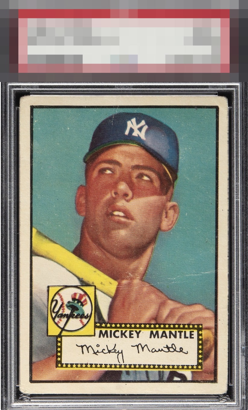
1952 Topps Mickey Mantle #311

Reviews & Discussions
12 total reviews

Strong centering despite mild tilt. Great image quality and well placed creases that don't disturb the image one bit.


Normally the surface issues and creases would drop this further for me, but the centering is excellent and this is such a hard card to find centered.

Excellent centering anchored by a strong black border that still presents beautifully. The expected corner wear is consistent with the era, while the blue remains vibrant and the registration sharp. A light crease is present, but it does little to distract. Overall, an outstanding example whose eye appeal easily outweighs the minor flaw.

My first gut instinct was B+ and it stayed that way on a long, close look at the card. B+ is really high for me and if that main crease were just a little sublter I could put this in the A- slot. The centering is obviously great for a 1952 Mantle. The crease is kind of "out of the way" to my eye. Overall eye appeal is better to me than were it super OC without the crease.


Outstanding centering with nice color and image. A few wrinkles and creasing holds it back for me.

the centering is better than most and nice bold borders make the card POP. IT has sharp image and solid colors that major crease and some speckling hold it back from greatness

Obvious wear but it is gentle on the eye. The centering and clean facial area win out on this one and put the eye appeal in a very rare tier.
EyeQ+
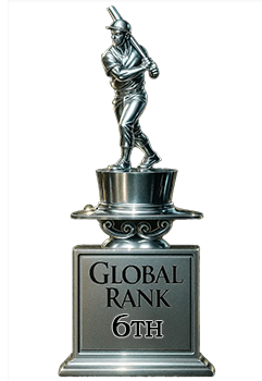
EYEQ+ TROPHY CASE

Rating Distribution
12 total reviews
How dare you crease this perfectly centered card kid? Take care of our cardboard next time. He could've been great kid, god tier even.