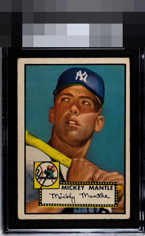
1952 Topps Mickey Mantle #311

Reviews & Discussions
8 total reviews

I like the rich colors but the centering drops this card into the B tier. Noticeable corner wear as well.

the image and background is amazing. The centering is off but nice and bold. There is some toning on the card. But Wow

The color and image are very nice. Background looks very clean. The centering knocks it down for me.

Solid B. Centering is shifted a lot but there is no tilt. Image is A tier. Good eye appeal which for THE card is always awesome.

The color looks very nice as does the image on this one. Typical centering issues and some corner wear keep this at B tier for me.

Love the image quality and absence of major blemishes and distractions on this Mick. The corners make only modest impact on eye appeal to me at this level of wear. Centering is really all that prevents the A Tier, so the result is very good overall eye appeal.
EyeQ+
EYEQ+ TROPHY CASE


Rating Distribution
8 total reviews
Beautiful image and colors. Shift and touched corners are the only distractions and they are really minimal on this grail.