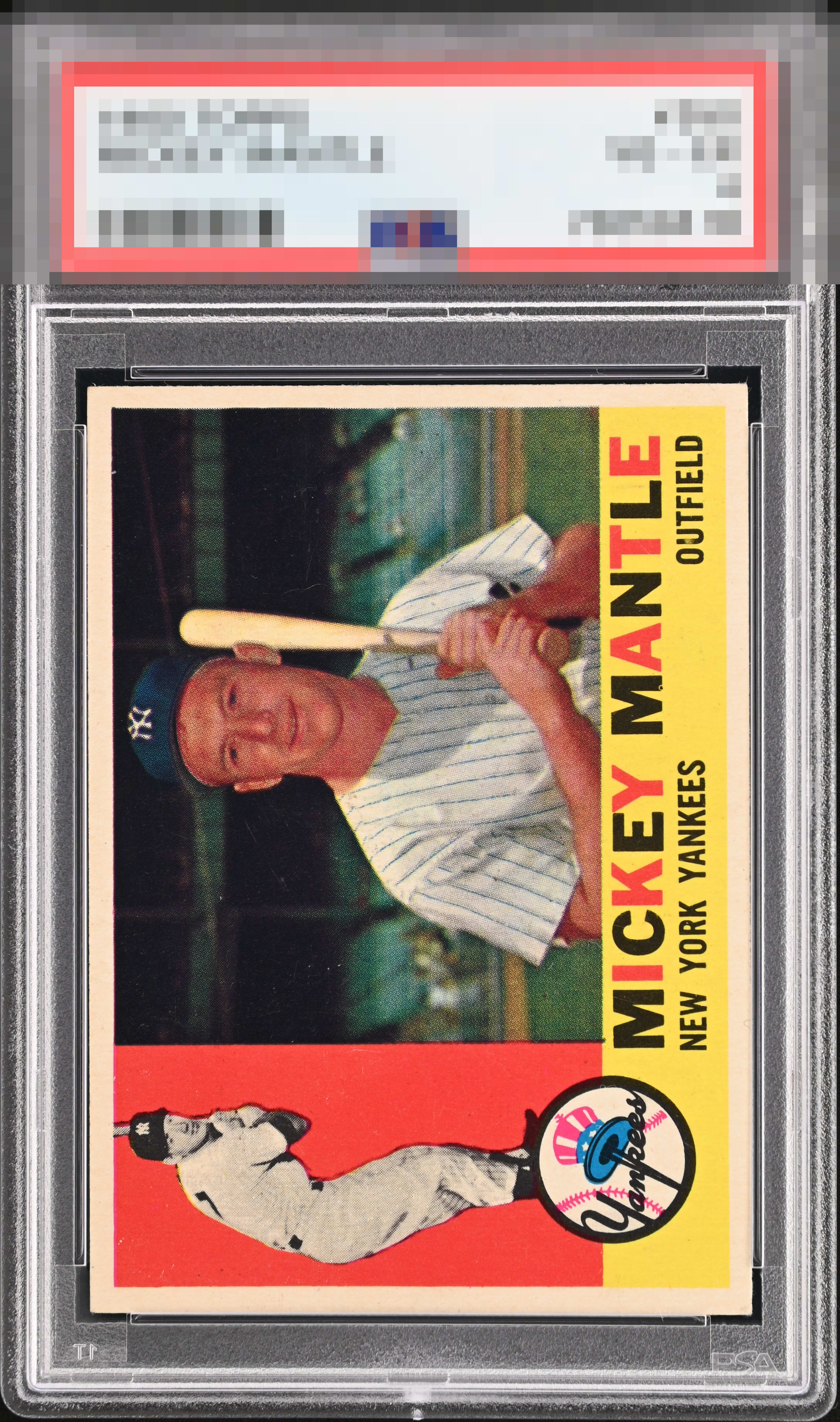
1960 Topps Mickey Mantle #350

Reviews & Discussions
11 total reviews

Practically perfect. More schmutz on the back than you'd want to see accounts for "only" an A+.

Beauty! Overall presentation is nearly perfect for me and the focus and crispness in his face is next level.

The red on the left looks very good, just a couple stray marks. Centering is a little off and there is some damage on the back, but this presents very well.

this is a Wow Card even with minor surface wear it blends in so well. The card catches my eye for the right reasons and keeps it

Centering from GT because the back is not a problem to me. The front of this card is nearly aesthetic perfection.


This is the kind of card I search for, far and wide. Back damage of this level is not an issue for me whatsoever. The front is SPECTACULAR. The larger Mantle image is often out of focus, and the red batting Mantle can be riddled with print dots. Not the case with this example!

For a card that is so often plagued with print issues and poor centering, this is a unicorn. Fantastic overall presentation.

Beautiful example. Very impressed with this card. The red area has no PD. The main image is crystal clear; it can often be blurry. And there is also no PD in the Yankees logo or nameplate.
EyeQ+

EYEQ+ TROPHY CASE


Rating Distribution
11 total reviews
If this card were any cleaner, I would suspect time travel. I have added this card to my “peaceful acquisition” list. It will be confiscated during the first wave.