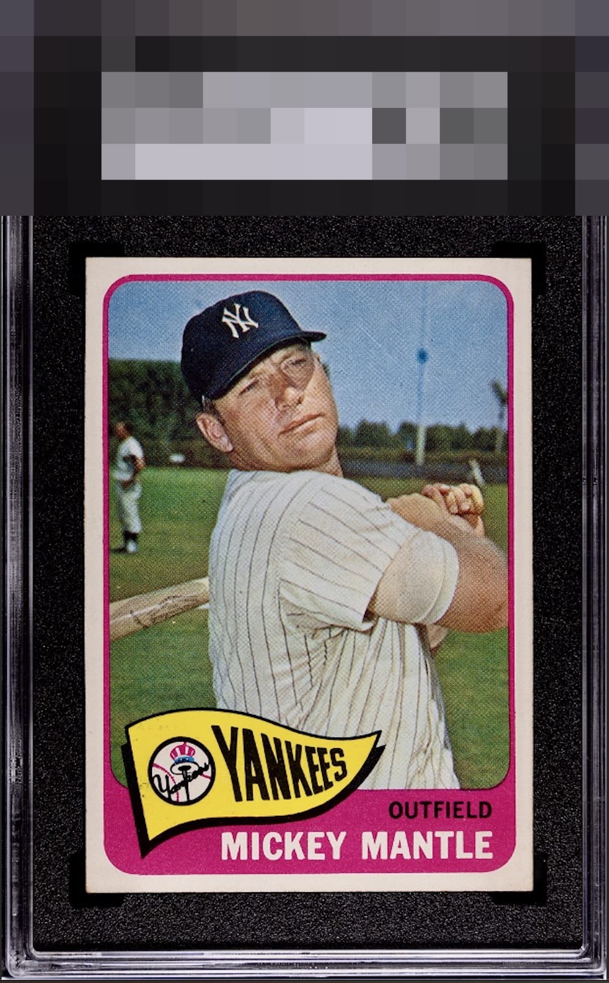
1965 Topps Mickey Mantle #350

Reviews & Discussions
14 total reviews

Vibrant colors mixed in with with the card focused holder and above average centering and edges make this card a winner


Small wrinkle in the sky is the only item bringing it out of god tier, great looking card.

Stunning image, stunning color, stunning centering. I would keep this one forever.

What a copy! The only small issue that I noticed was the black overprint left of the Yankees logo, but I had to expand the size of the picture to notice it. This would be my forever copy of this card. Awesome example!


Great looking example. Sharp corners and nearly 50/50 centering

I just can't find anything I dislike here. Is this the best centered 1965 Mantle around? This card is always tilted. Well done.

This card is dynamite. Excellent color and centering. It really pops. Some noice is in the background keep from a top two score. Love this card.
EyeQ+
EYEQ+ TROPHY CASE


Rating Distribution
14 total reviews
Ok what would I be looking to upgrade eye appeal wise if I owned this? This is GT all the way. My eye is PLEASED!