1965 Topps Mickey Mantle #350
1 / 2

Click to enlarge
💬
Reviews & Discussions
8 total reviews

As a centering guy this is shifted a bit too high to make my A tier, but the rest is certainly deserving.

Everything here is top tier except the centering. Eye appeal remains on the higher end.

It's more than a bit bottom-heavy, but it's very sharp and the color has held up.

clean and bright but not as clear as i would like. Centering is off but not badly for me


Centering is the lone issue of weight here, as the rest looks great. The clean banner and nameplate areas are ideal.
Locked
1 review
EyeQ+
112.0
Global Population
7
POPULATION ACROSS ALL GRADES AND GRADING COMPANIES
Global Eye Rank
#6
Population in Grade
1
POPULATION IN THIS GRADE AND GRADING COMPANY
Eye Rank in Grade
#1
EYEQ+ TROPHY CASE
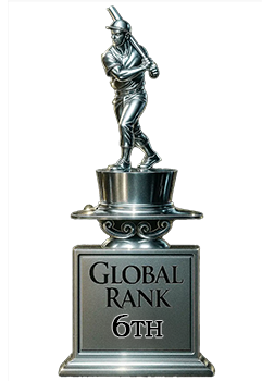
6th Place
GLOBAL

1st Place
IN-GRADE
📊
Rating Distribution
8 total reviews
G
0%
A+
0%
A
1 rating
14%
1
A-
3 ratings
43%
3
B+
2 ratings
29%
2
B
1 rating
14%
1
B-
0%
C+
0%
C
0%
C-
0%
D+
0%
D
0%
D-
0%
F
0%
Great looking 65 mantle and solid centering!