1964 Topps Mickey Mantle #50
1 / 2

Click to enlarge
💬
Reviews & Discussions
8 total reviews

Focus, centering, and, surface issues really hurt the viewing experience.


The R/L shift and touched top corners are noticed first, then the nice image and acceptable print carries the card's eye appeal very well.


center is to extreme for my liking as it really effects the eye appeal.

Great image and color serve to counterbalance the extreme centering shift and fish eye.
Locked
1 review
EyeQ+
94.0
Global Population
9
POPULATION ACROSS ALL GRADES AND GRADING COMPANIES
Global Eye Rank
#7
Population in Grade
1
POPULATION IN THIS GRADE AND GRADING COMPANY
Eye Rank in Grade
#1
EYEQ+ TROPHY CASE
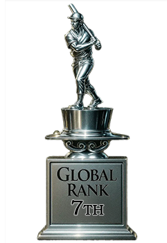
7th Place
GLOBAL

1st Place
IN-GRADE
📊
Rating Distribution
8 total reviews
G
0%
A+
0%
A
0%
A-
0%
B+
0%
B
1 rating
14%
1
B-
1 rating
14%
1
C+
2 ratings
29%
2
C
2 ratings
29%
2
C-
1 rating
14%
1
D+
0%
D
0%
D-
0%
F
0%
Centering and a fish eye in the black area dampen the eye appeal though the image and surface earn the plus.