1966 Topps Mickey Mantle #50

Reviews & Discussions
11 total reviews

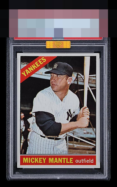
Tilt lowers eye appeal but I know this card well and that bottom red name and position box is very clean; it usually has PD.


Nice image and the card is clean. Centering tilt is the main issue for me.


Colors and image are strong. T/B the centering is good. But L/R it's pretty uneven. The tilted image really draws my eye.

Paging Lord Slabington. Punches above its weight. Solid B+ with only side border "sway" the eye appeal dampener, to me, here. Super sharp corners are not my jam on pre 1970s cards, so this card is the kind I snap up and keep.

The Red and Yellow POP out nicely and provide and nice color contrast. The image is strong as is the colors with some speckling scattered around. The Borders are nice and clean but off center. OVerall a Nice mid level card
EyeQ+
EYEQ+ TROPHY CASE


Rating Distribution
11 total reviews
Solid looking card with tilt and some general wear, but nothing egregious.