1960 Topps Mickey Mantle #563
1 / 2

Click to enlarge
💬
Reviews & Discussions
7 total reviews

Some staining and centering detract from the card, but the color and sharpness of the image are plusses.

Very good eye appeal. Centering is off both ways but it doesn't make huge impact to me.

Honest corner wear, nice print, and above average centering. The white could be a little brighter but sweet example. I like it.

I like this card and find the eye appeal very good. Wear is subtle on the eye, centering is solid, and no loud distractions.

nice card that can be enjoyed but nothing shouts out that makes it special

Locked

0 reviews
EyeQ+
125.0
Global Population
3
POPULATION ACROSS ALL GRADES AND GRADING COMPANIES
Global Eye Rank
#3
Population in Grade
2
POPULATION IN THIS GRADE AND GRADING COMPANY
Eye Rank in Grade
#2
EYEQ+ TROPHY CASE
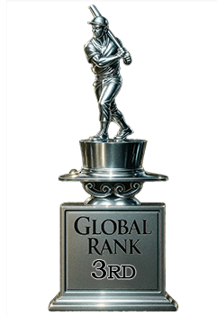
3rd Place
GLOBAL

2nd Place
IN-GRADE
📊
Rating Distribution
7 total reviews
G
0%
A+
0%
A
0%
A-
3 ratings
43%
3
B+
2 ratings
29%
2
B
2 ratings
29%
2
B-
0%
C+
0%
C
0%
C-
0%
D+
0%
D
0%
D-
0%
F
0%
Good color and registration. OC and mild corner wear are what keep it from going higher. Nice card