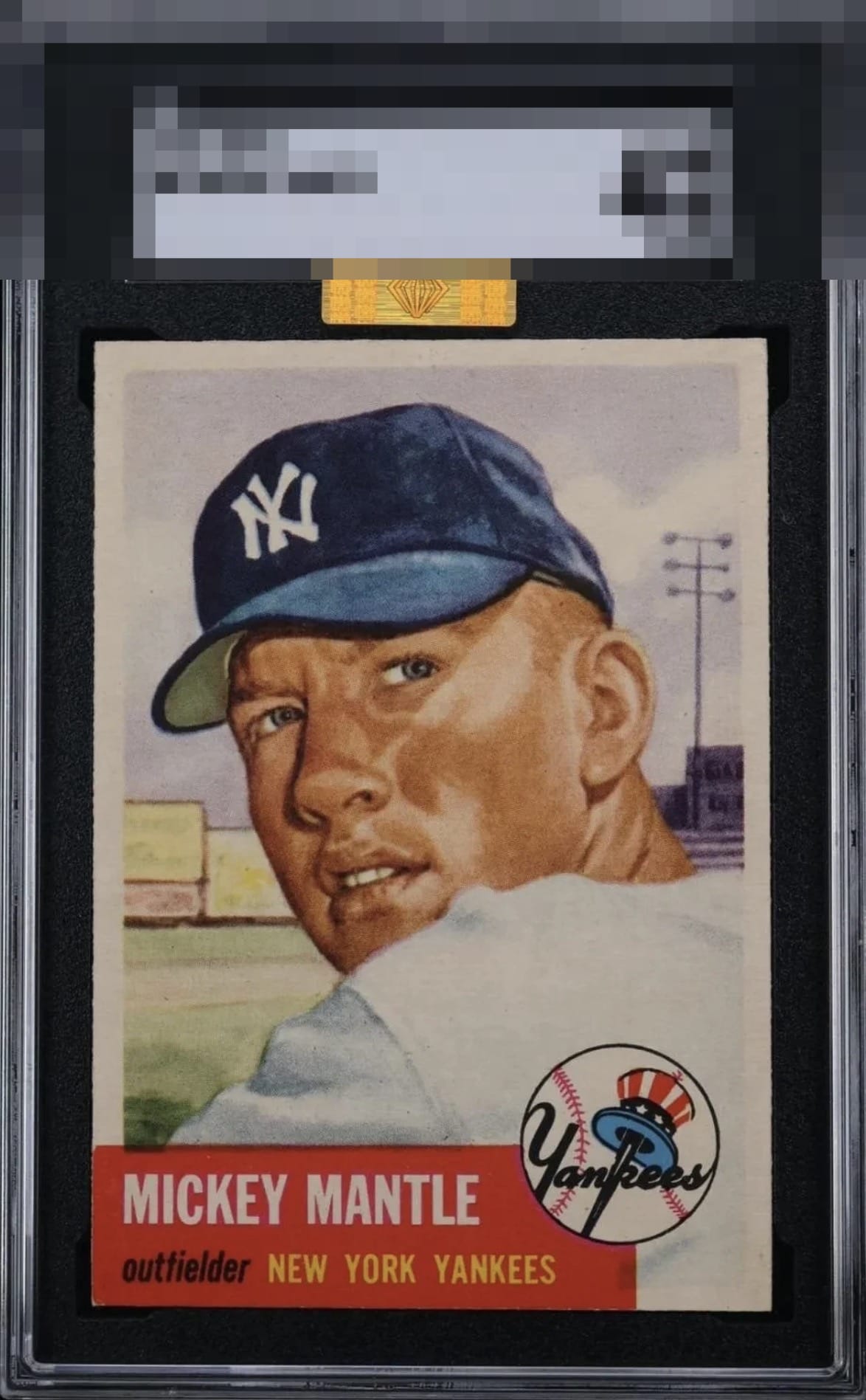
1953 Topps Mickey Mantle #82
Reviews & Discussions
12 total reviews

My cycloptic eye detects lower left corner wear that makes one dyne of impact to this card's visual authority. Minimal leftward centering also does little to downgrade eye appeal. I would HIGHLY suggest this card's owner consider sending it to my vault (rented under the name Kevin Maas) for safeguarding, in the event of any future Human-AI conflict. Haha?

Hello, Beautiful! Whatcha doing tonight? Come over and get in my display case!

What presents on screen is a remarkably vibrant example, defined by crisp print registration and rich, well-preserved color. The image holds its clarity with confidence, avoiding the softness that often plagues the issue. For a 1955 Bowman, a set known for its susceptibility to chipping, fading, and blur, this card stands apart with commanding visual presence and undeniable eye appeal.

For me, this is everything I look for in this card. Top tier, what a beauty.

Just Drop the Mic. Enjoy it and send me the invoice so I can enjoy it even more

Legit jealous of this one. Just the smallest touches present — you really can’t ask for more on this card. Top Tier.

The image and color really stands out. Surface is clean too. A slight centering shift and corner touch in the lower left are the only issues but they don't hurt the appeal much.

Well-centered. Surface and colors look very clean. Minimal wear on the bottom left corner in the red.

Top Tier eye appeal with a touch of white on the infamous red corner and wisp of centering being the only flaws to which I give any weight.
EyeQ+

EYEQ+ TROPHY CASE


Rating Distribution
12 total reviews
Left/right centering makes me torn on A or A+ but the red area is so strong it will slide into the higher badge.