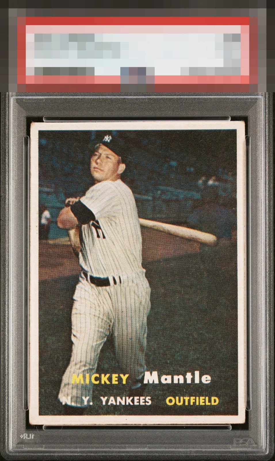
1957 Topps Mickey Mantle #95

Reviews & Discussions
10 total reviews

Corner wear is clearly evident and would be the major flaw. The centering is extremely strong for the issue and the borders are Snow White.

This is a sneaky good find. Most will walk away because of the corners, but the image and centering are strong. I see the tilt, but it doesn't really move me.

An elite example of the '57 Mickey with very minor issues that prevent only the highest badges: a touch of centering and tilt, corner wear, and if you compare several copies you can see the face can sometimes be found with a touch more focus.

All I got is some corner wear. Great centering for this card in this set.

Can’t really ask for better framing. Bright white borders & tight reg. Corner touches are the only thing holding this one back from A+ for me.

Slight tilt, but this card is rarely centered better than this. Minor surface wear doesn't impact the appeal much either. Nice card!

Very strong example. Minor tilt is all I can cite. Great eye appeal.

love the overall look of this card. It has border issues but with some discoloring but not near the image and does not effect the overall appeal to much. the centering is off which holds the card back but the image is clean and the details and colors are nice


EyeQ+
EYEQ+ TROPHY CASE

Rating Distribution
10 total reviews
Slight roundness to the corners but a sharp image and color. The centering is spot on.