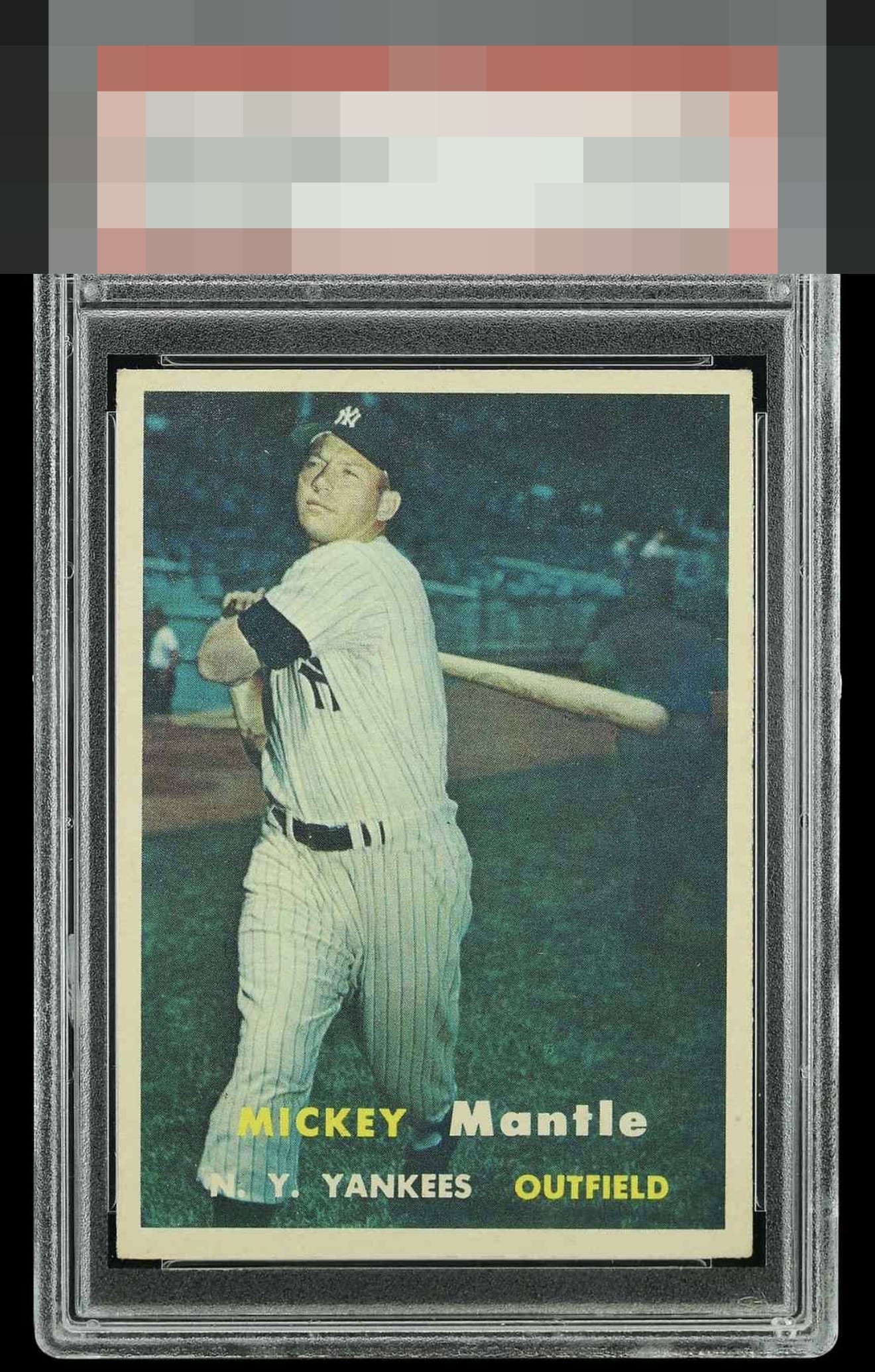
1957 Topps Mickey Mantle #95

Reviews & Discussions
7 total reviews

Centering is good but a little off. Clean card but color seems a little faded, doesn't pop.

Centering is strong for this example which is notoriously one of the hardest to find centered in the 57 set. Corners and edges are strong, and with just a touch of Boulder color on this card it would warrant a higher grade. Excellent example.

T/B centering catches the eye a tiny bit initially. Excellent registration and honest corner touches. Clean, nicely centered, back makes for an overall wonderful card. Very nice eye appeal.


Pinpoint registration drives strong eye appeal here, as the letters of his name, team, and position look great. Centering is second tier, yet certainly well above average for this rather notoriously OC card.

EyeQ+
EYEQ+ TROPHY CASE


Rating Distribution
7 total reviews
Centering is good enough to keep my interest and I see no major print issues. A solid A tier card.