1959 Topps Norm Cash #509

Reviews & Discussions
11 total reviews

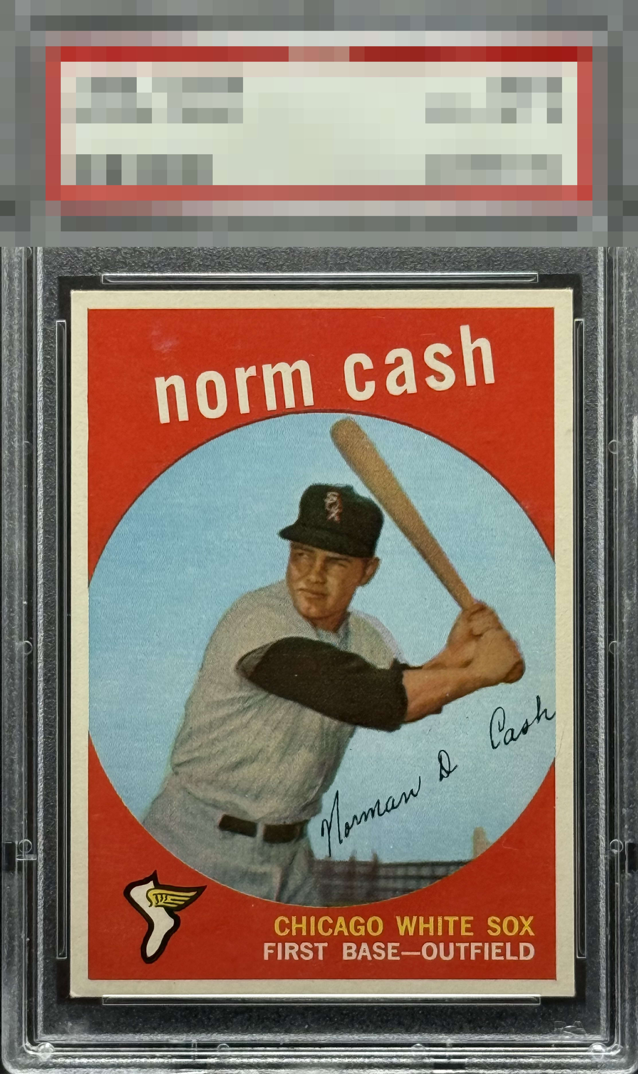
Stand out example. Strong card , only slight disturbance in the red and some light ones on the back that's aren't distracting.

Some color breaks in the red above the first and last name draw my eye away from the obvious beauty of the rest of the card.

Reds absolutely leap off the cardboard. Centering is solid. A slight blemisy above the 'N' detracts a bit from teh overall eye apeal but not much to take it lower than a solid A-.


Great copy w/ bold color and above average centering. Just what looks like a slight tilt and a couple surface blemishes hold it back from A+ tier.

Beautiful card with the only noticeable blemish is the surface wear over the "n" in "norm"

Solid centering and colors with just a bit of surface scuffing above Norm's name and some light discoloration on the reverse. Handsome looking card.

I see nothing but splendor here. Maybe, maybe a tick centered to the left is worth citing, but it hits the eye as centered at first blush. The patch of weak color above the N in Norm is somehow not as bad as it seems when I enlarge the card, so will give that a pass. STRONG.

nice looking card. THe colors do not POP but they are clean and the image is strong. Nice corners and centering
EyeQ+
EYEQ+ TROPHY CASE


Rating Distribution
11 total reviews
My ocular unit reports strong aesthetic presentation and only nominal corner-related turbulence. The owner may keep this card. For now. EyeBot is feeling generous.