1963 Topps Pete Rose #537

Reviews & Discussions
12 total reviews

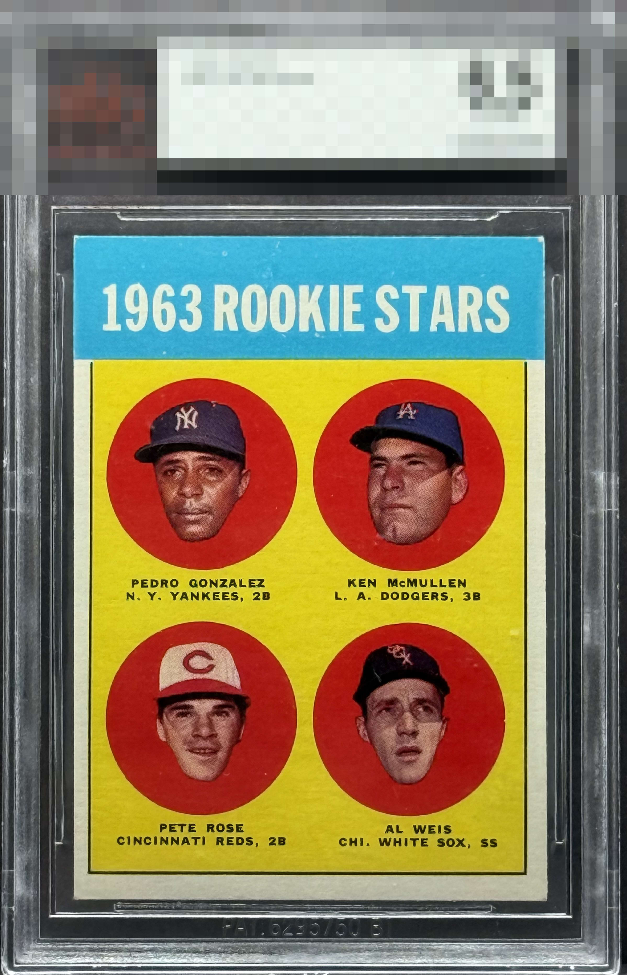
Presents well. Great centering. Dark stain on the back holds it back from a higher grade


Somewhat nice corners on a tough blue, but I notice the centering quickly which leads to the surface bubble.


I know the Rose RC very well. This one has standout yellow and red areas that are free from PD issues that can wreck the eye appeal for me. The blue concedes some PD and the centering for me holds it back.

This Pete Rose True Rookie is a standout example with vibrant color and crisp imagery that immediately draw the eye. Its flaws are few but noticeable as the centering drifts both left to right and upward. A print bubble in the yellow field beside the Sox cap also catches attention. Even so, the overall presentation remains strong and the least attractive element is not the card itself but the slab housing it.

This card has some nice characteristics. However, the bottom adjustment, upper right corner, and mark half way up in the yellow on the right side hurt the appeal on this one.

Nice card but the white tips, slight off centering and print bubbles are the drawbacks.

strong colors and strong image nothing to glaring except a bubble on right side above and to the right of Weiss and a brown spot on the back by the word minor
EyeQ+
EYEQ+ TROPHY CASE


Rating Distribution
12 total reviews
A+ Color B Registration / Surface B- Cut / Centering avg centering plus tilt. typical 1963 Topps fisheye print issues (although won’t be seen much from 18” - 24” away). Excellent color that pops even through the Beckett thick slab and inner penny sleeve.