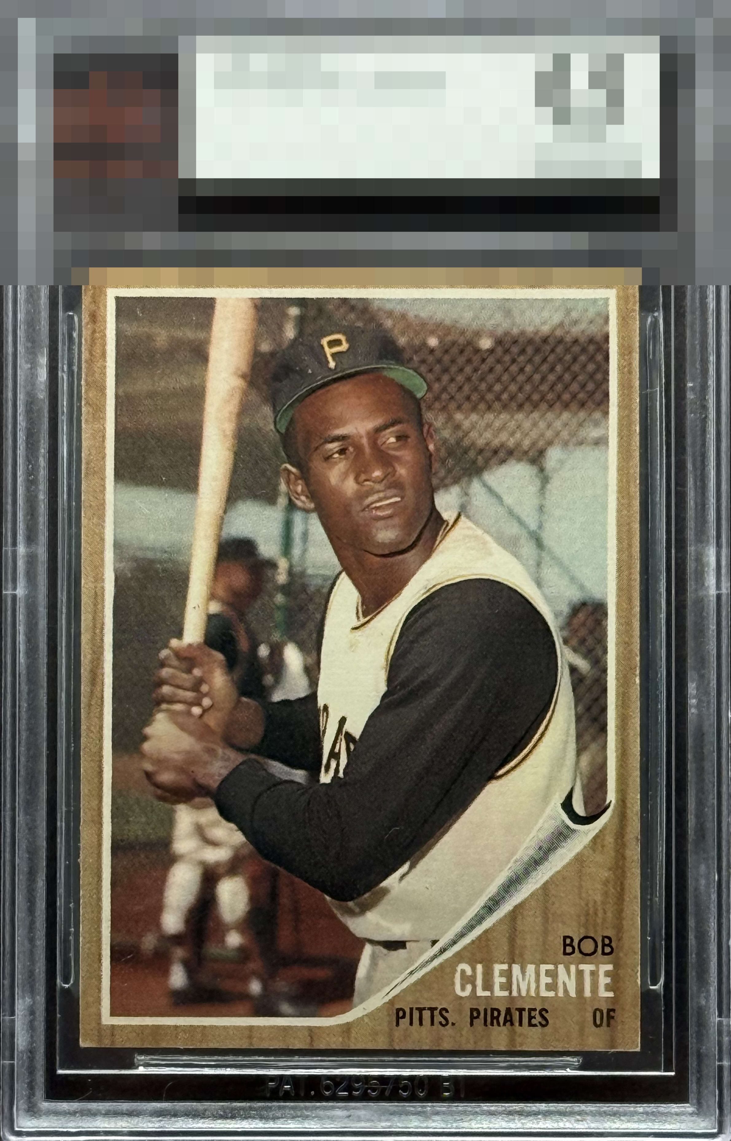
1962 Topps Roberto Clemente #10

Reviews & Discussions
12 total reviews

Outstanding example. Centering is tight. Some damage on the top right and bottom left corner, but the overall surface is so strong.. Creating a really nicely presented example

This ’62 woodgrain classic has a bit of softness in the upper right and lower left corners, but everything else is fantastic. The centering, the print registration, and the color really shine. So it’s got that nice little hint of personality with those corners, but overall it’s a really strong card.

The centering and smooth edges for a 62 carry this. Better top right corner this gets an A+.


Solid card. Really great centering. Those white tipped corners jump a little too much for me as does some scruff on the hat.


Great centering and color for this issue. Just some white corner wear holds it back but great example!

white speckling in various places like the hat and minor corner wear but nothing "displeasing". The image is strong and overall clean
EyeQ+
EYEQ+ TROPHY CASE


Rating Distribution
12 total reviews
Silky edges. Centered. That degree of corner wear is meh to me.