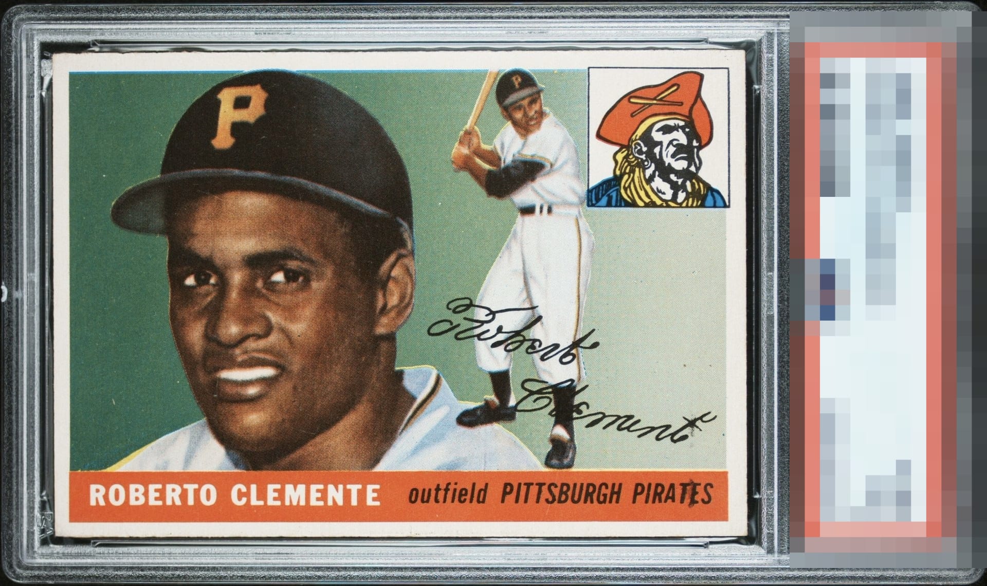
1955 Topps Roberto Clemente #164

Reviews & Discussions
12 total reviews

Super solid A level eye appeal. I notice the centering is a tad off and there's a smudge on the E in PIRATES that does hit my eye, yet nothing enough to knock it from the elite A pedestal.


I’ll mention the small print defects but it goes unnoticed. Amazing centering combined with supreme color and overall sharpness. Fantastic example!

Incredible copy of this card. Centering isn’t perfect but it is very close. Very special card

A poised, high grade example. Print registration is excellent, the palette holds strong, and the centering presents with real confidence even if it is not mathematically perfect. Light specking and a few trivial quirks are present but never intrusive. The card reads clean at face-to-screen length and rewarding up close, earning a comfortable place in the A tier for eye appeal. A beautiful card.

Only if you look. Really look will you find issues. They are there like the speckling in the green to the left of the face. Centering if you really look or use a measuring/centering app. But what I see is a Great Color. Such strong colors and a very sharp image. I see nice bold and what borders. I see a Sweet card that falls just short based on really needing to look


Gorgeous copy. Dynamic colors, clean borders, and sharp corners elevate the status. Some background specks and the slightest centering shift particularly right to left are the only things that distract the eye.

Not sure how this is a 7 but the card is spectacular. Borders. Centering. Colors. Love this card.
EyeQ+
EYEQ+ TROPHY CASE

Rating Distribution
12 total reviews
Ultra strong card. Touch of centering and a spot of PD in Pirates.