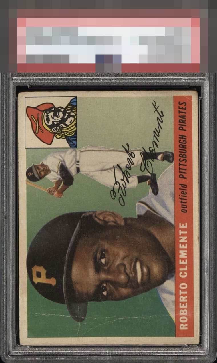
1955 Topps Roberto Clemente #164
1 / 2

💬
Reviews & Discussions
6 total reviews

What looks like creasing is the first thing that catches my eye. That said, the centering and registration look solid enough to me to hold the overall presentation together.

Centering isn't great but not bad, and the creases are well placed. A decent looking low grade example.

Off Centered and wear on the borders and discoloration. The vertical Crease on left side is really an eye catcher for the wrong reasons The main image and colors do hold up ok


Has charm and nice centering. The crease avoiding his face is clutch.
6 reviews

0 reviews
EyeQ+
--
Not eligible for AUTH cards
Global Population
11
POPULATION ACROSS ALL GRADES AND GRADING COMPANIES
Global Eye Rank
—
Not eligible for AUTH cards
Population in Grade
1
POPULATION IN THIS GRADE ACROSS ALL GRADING COMPANIES
Eye Rank in Grade
—
Not eligible for AUTH cards
EYEQ+ TROPHY CASE

GLOBAL

IN-GRADE
EyeQ+ scores are not available for AUTH cards.
📊
Rating Distribution
6 total reviews
G
0%
A+
0%
A
0%
A-
0%
B+
0%
B
1 rating
17%
1
B-
2 ratings
33%
2
C+
0%
C
1 rating
17%
1
C-
1 rating
17%
1
D+
1 rating
17%
1
D
0%
D-
0%
F
0%
Obvious flaws but special card regardless