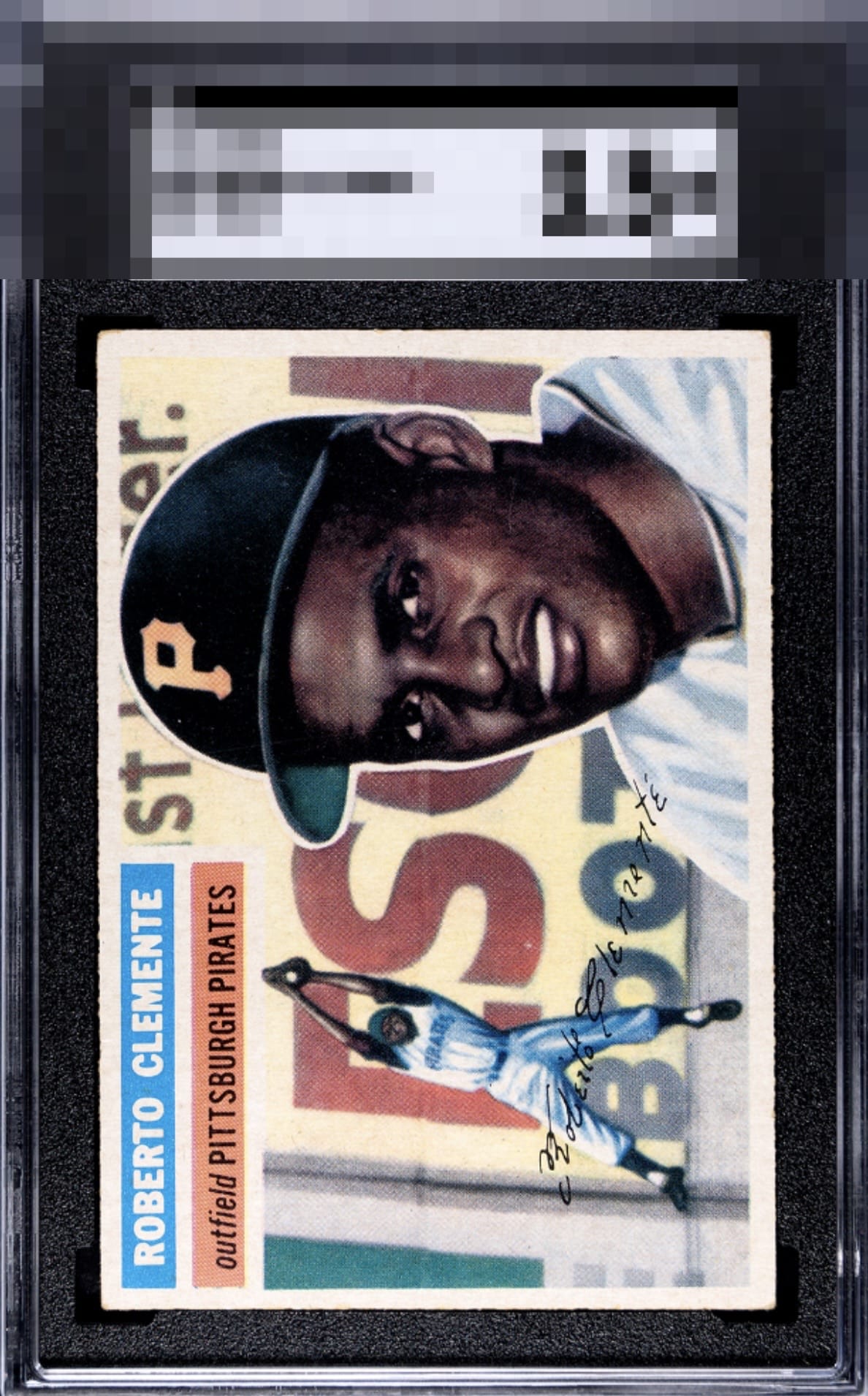
1956 Topps Roberto Clemente #33
1 / 2
Click to enlarge

💬
Reviews & Discussions
7 total reviews

The corners knock the technical grade but don’t affect the eye appeal much.


Nice-looking card with strong centering, but the fading caps it in the B tier for me.

Centering looks good. A little off, but better than most. Image looks nice, but the color has faded.

always love a bright card and this card is bright but seems more like fading bright. But the image and the colors are solid and the image POPs. The centering is off slightly but still good to me.

Colors look a bit washed out. Decent centering. Solid card but doesn't pop.
Locked

0 reviews
EyeQ+
128.0
Global Population
5
POPULATION ACROSS ALL GRADES AND GRADING COMPANIES
Global Eye Rank
#2
Population in Grade
1
POPULATION IN THIS GRADE ACROSS ALL GRADING COMPANIES
Eye Rank in Grade
#1
EYEQ+ TROPHY CASE

2nd Place
GLOBAL

1st Place
IN-GRADE
📊
Rating Distribution
7 total reviews
G
0%
A+
0%
A
0%
A-
1 rating
14%
1
B+
4 ratings
57%
4
B
1 rating
14%
1
B-
1 rating
14%
1
C+
0%
C
0%
C-
0%
D+
0%
D
0%
D-
0%
F
0%
Colors are a bit washed but the centering is super and the overall eye appeal is solid.