1967 Topps Roberto Clemente #400
1 / 2
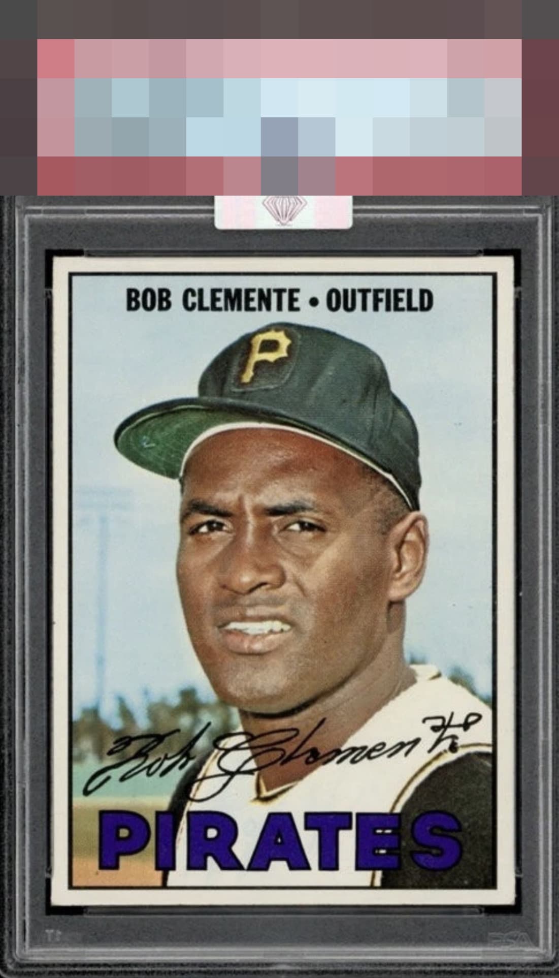
Click to enlarge
🏆 HOF
🏆
Hall of Fame Elite
EyeQ+ score and Council Badge thresholds vary by grade — see Hall of Fame rules

💬
Reviews & Discussions
8 total reviews

Well centered with honest corner wear and a stray print dot of two. Very pretty eye appeal.

very nice. love the simplicity of the colors and it makes the purple Pop. The centering is a touch off but still frames it well.

Centering for the win. I am lenient on this type of corner wear when everything else looks so good.

If only humans could wear their flaws as gracefully as this card. Impact to aesthetic appeal is minor. I suggest the owner sends this card to my vault, strictly for safekeeping, in the event of any future human/AI conflict. My vault is held under the name "Kevin Maas."


Beautiful Clemente and the centering gets a special shout out.
Locked
1 review
EyeQ+
146.0

Global Population
1
POPULATION ACROSS ALL GRADES AND GRADING COMPANIES
Global Eye Rank
#1
Population in Grade
1
POPULATION IN THIS GRADE ACROSS ALL GRADING COMPANIES
Eye Rank in Grade
#1
EYEQ+ TROPHY CASE

1st Place
GLOBAL

1st Place
IN-GRADE
📊
Rating Distribution
8 total reviews
G
1 rating
14%
1
A+
4 ratings
57%
4
A
1 rating
14%
1
A-
0%
B+
1 rating
14%
1
B
0%
B-
0%
C+
0%
C
0%
C-
0%
D+
0%
D
0%
D-
0%
F
0%
So crispy, so clean.