1958 Topps Roger Maris #47

Reviews & Discussions
12 total reviews


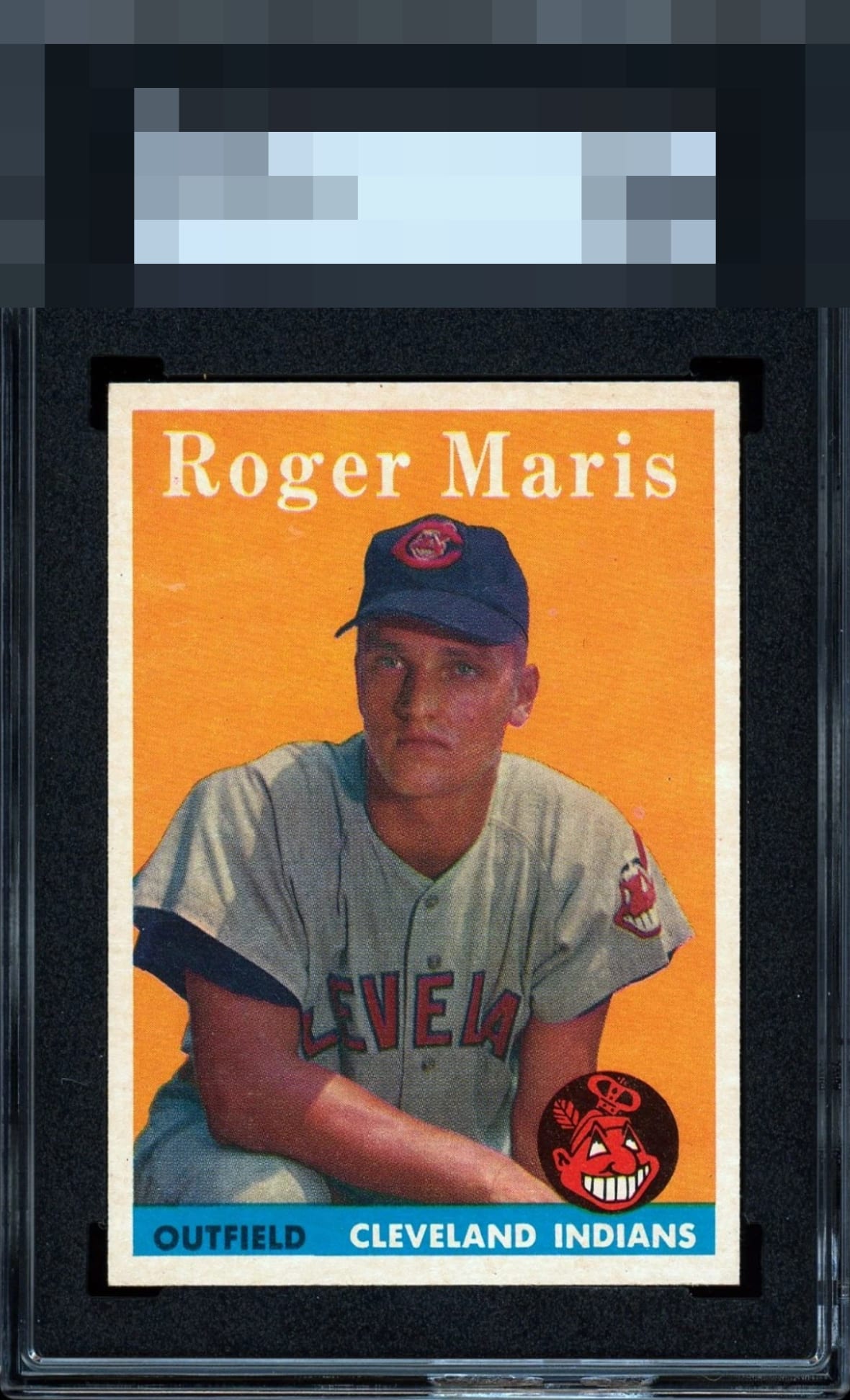
Beautifully centered with the surface issue under the “R” is only item taking it out of god tier.

How great are SGC slabs on a card like this? Card seems close to flawless but the colors are just incredible here.

Okay. I was planning on taking a much needed one day off from the site, but then one of ya'll messaged me about this allegedly bananas Maris RC. This card, is, indeed, bananas. I could make this a poster card for the site. Maybe one day I'll do mugs with the top rated cards and the site logo. I don't know. What I do know, is this is powerful. Bravo. The centering is great. The image quality is so great-- and soooo many of them are botch jobs on registration. I'm bowled over by this card. GT.

This is SPECIAL! Big, white borders that are nearly dead-even. Focused registration. Nary a blemish in the solid-color background. EXACTLY what I look for to please my eye. This is the kind of card that gets a BIN button SMASHED.

Simply a great looking card. The image is sharp and the colors are strong(The orange background below "Roger" is an issue but barely noticeable. But to me all about the Borders. Big and Bold and Centered and SO SO Bright Love it

This 1958 Topps Roger Maris rookie is a true head-turner. The centering is nearly textbook, a rare treat for this issue, and the print registration is sharp enough to highlight every detail of the portrait with striking clarity. The lone flaw lies just to the left of his cap under the “R,” a subtle imperfection that doesn't keep it out of God Tier territory. Whether it’s a faint crease or a small printing quirk, it does little to dull the overall charm. A card of this caliber is the kind any collector would be proud to showcase, a card that exudes both history and elegance.
EyeQ+
EYEQ+ TROPHY CASE


Rating Distribution
12 total reviews
Showstopper.