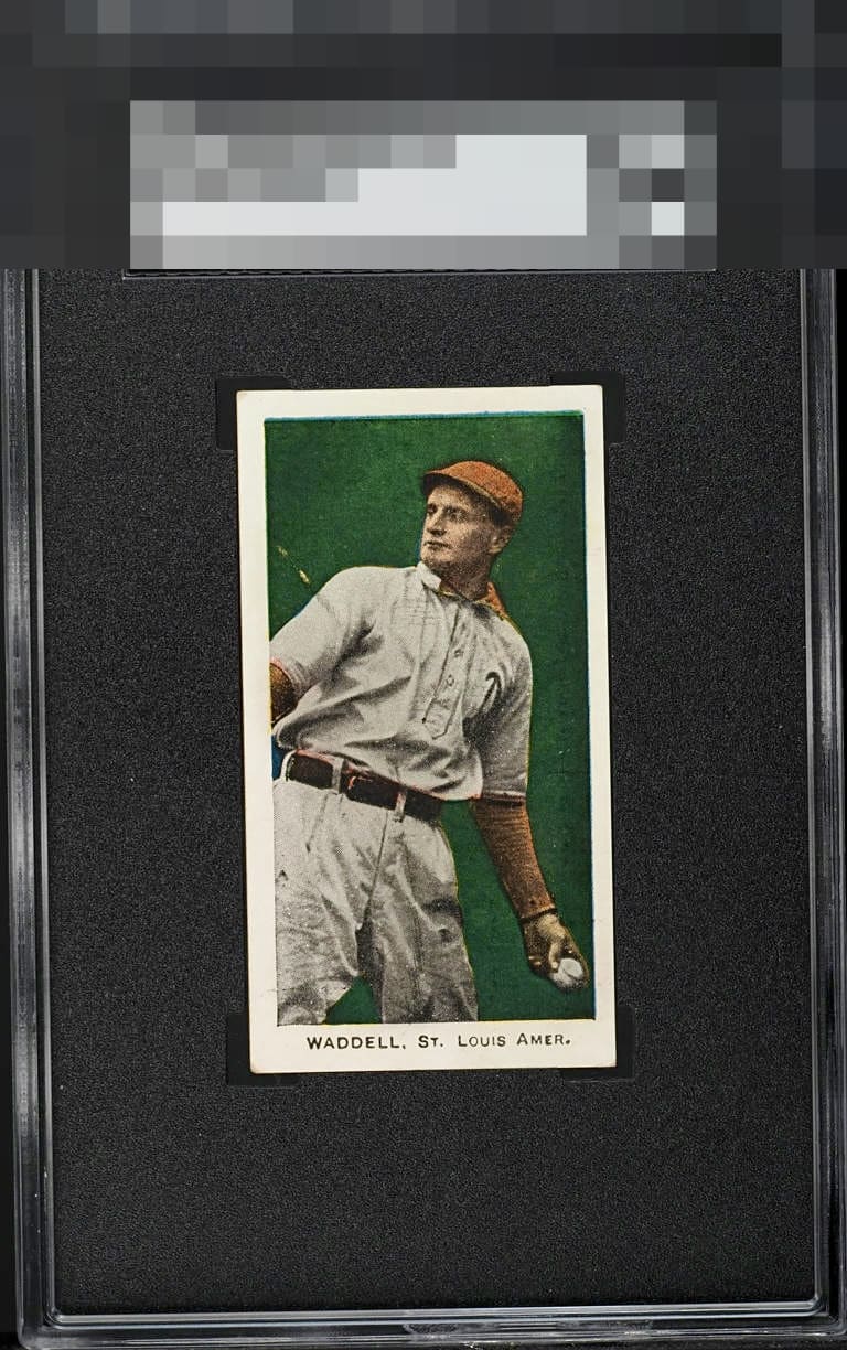
1910 E93 Standard Caramel Rube Waddell

Reviews & Discussions
13 total reviews

Nice card, great colors. That line across the arm is the only real flaw, besides sub-optimal centering.


That green pops. Just slightly off center and an unfortunate surface line, but it doesn’t overly distract from an otherwise great card.


The background color is rich for any card let alone one that is 115 years old! The borders are white. The centering is the main issue for me or we'd be in even more extreme eye appeal territory.

Incredible color and registration for this card. The line by his arm and off centering prevent a higher grade, but it's a beautiful copy.

Unless you’re planning to wander into the stands to pet a dog or hitch a ride on a fire truck, your eyes should be glued to this card. The coloring pops, the image is crisp, the dark green background sets it off beautifully, centering is strong, and the text is razor-sharp — easily A-tier.

cannot tell from the photo what the line is on the non throwing arm. THe colors pop. THe borders are clean. Slightly off center. But the Deep Green really catches my eye
EyeQ+
EYEQ+ TROPHY CASE


Rating Distribution
13 total reviews
Like the color and brightness. Centering and the line on arm are what bring down the eye appeal on this card.