1955 Topps Sandy Koufax #123

Reviews & Discussions
11 total reviews

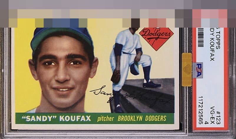
Ok it’s OC but need sunglasses for how incredibly vibrant this one is!

I like this example. The color, registration, sharp corners are firing on all cylinders. I can discount the L to R centering to keep it in the A range.

The color and the main image on this card look great. Even the borders are a nice bright white. Centering is a little off with a slight tilt, but it's centered better than many higher grade examples.

Very easy on the eye. Centering the only drawback and it is mild, hence the A tier.

I'm a centering snob and that's the only item missing from this card. Beautiful example.

Hits the eye like a MINT card and the only aspect my eye craves improvement on is centering. Outstanding Sandy!

She's a beaut! Sharp image and vibrant colors. L to R centering just a bit off.

A few spots on the face and the centering is shifted to the left. Colors and image are strong.

I notice the white dot in the red box. Then I say so what the rest of the card is amazing and clean and bright and colors POP Wow and the slab doctor needs new glasses
EyeQ+
EYEQ+ TROPHY CASE


Rating Distribution
11 total reviews
The tilt would usually put the eye appeal at B+ max for me but in this case the overall card is so pretty with such strong attributes it jumps up into the As. Great eye appeal on this card.