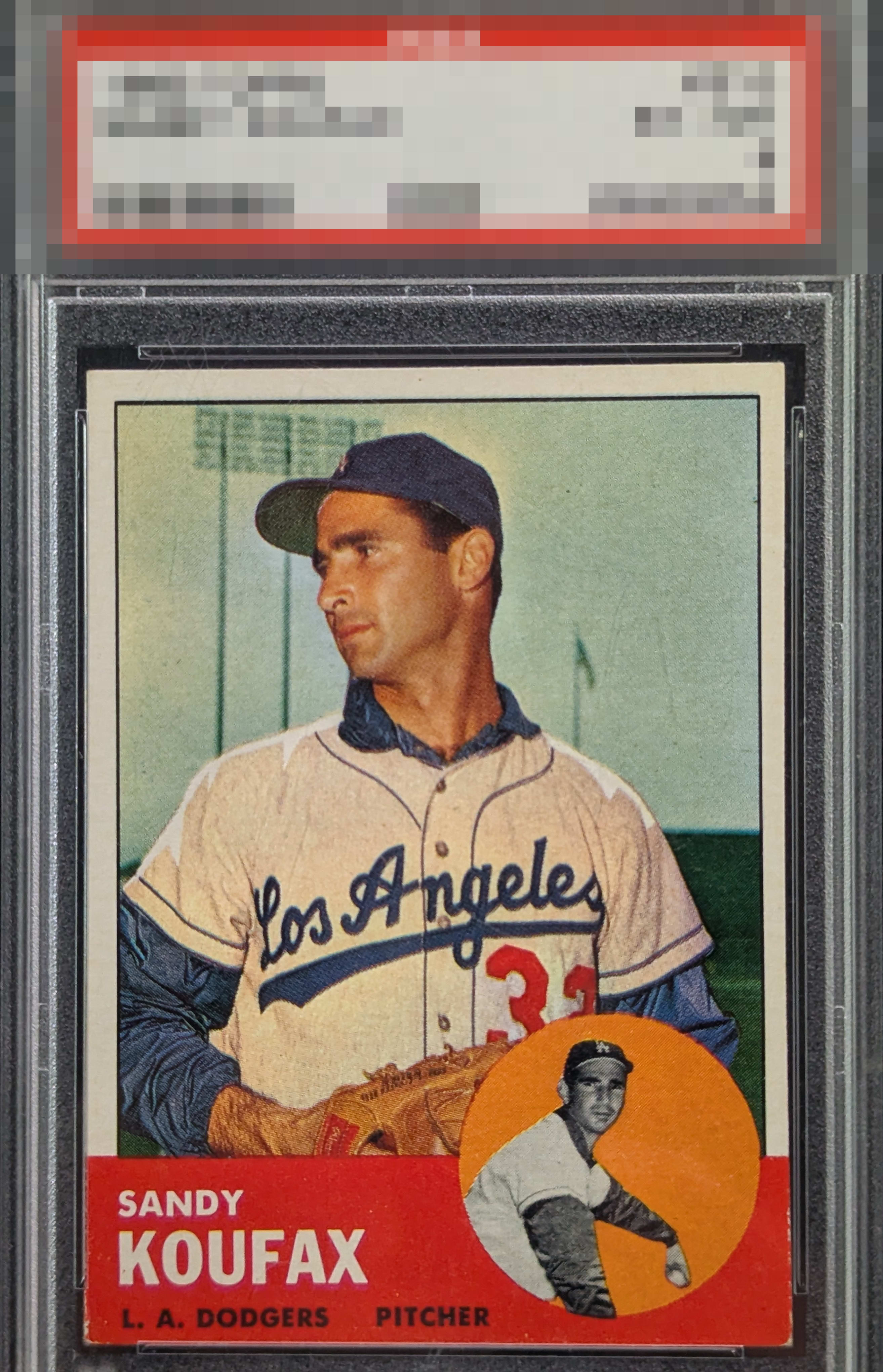
1963 Topps Sandy Koufax #210
1 / 2
Click to enlarge

💬
Reviews & Discussions
9 total reviews

Centering is nicer than most, although shifts noticeably to the left, it remains thick. Red has minimal print defects but shows honest corner wear. Eye appeal remains very good. Nice copy

Great solid color with no PD. Centering and some edgewear keeps eye appeal in second tier.


nice looking card that presents well the L/R centering and the nicks in the red box below holds it back from greatness


Love the clean background of the "circle Sandy" and how its color has no PD. I always check that on any '63. The sensitive red edges and corners are also on the strong side. Centering is the one issue, yet eye appeal remains very good.
Locked
2 reviews
EyeQ+
109.0
Global Population
3
POPULATION ACROSS ALL GRADES AND GRADING COMPANIES
Global Eye Rank
#2
Population in Grade
1
POPULATION IN THIS GRADE ACROSS ALL GRADING COMPANIES
Eye Rank in Grade
#1
EYEQ+ TROPHY CASE

2nd Place
GLOBAL

1st Place
IN-GRADE
📊
Rating Distribution
9 total reviews
G
0%
A+
0%
A
1 rating
14%
1
A-
2 ratings
29%
2
B+
2 ratings
29%
2
B
1 rating
14%
1
B-
1 rating
14%
1
C+
0%
C
0%
C-
0%
D+
0%
D
0%
D-
0%
F
0%
My supremely intelligent cycloptic eye is pleased. While mild flaws are detected, they do not cry out attention. If only humans could master such subtle harmony. I have placed this card on my list, for acquisition and safekeeping in the event of any future human/AI conflict. cc: Skynet.