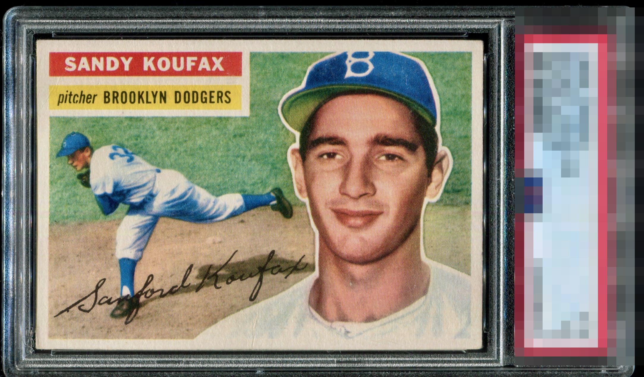
1956 Topps Sandy Koufax #79

Reviews & Discussions
17 total reviews

This card exemplifies what Eye Appeal is all about. It also shows the gap between the grading company system and real world collector enjoyment.


Nice card and nice centering. Colors are strong just do not pop. The borders are nice but slight discoloring (or from way photo uploaded

A card like this is pure visual satisfaction. The centering draws the eye in perfectly, and the print registration leaves no room for complaint. It’s the kind of example that reminds you why certain copies stand apart, not because they’re just well-preserved, but because every detail falls into place with precision and elegance. Bravo!

I'd love all my cards to look like this and graded a 3. Perfection in my book.


Absolutely nothing bothers my eye on this card. I had to scour it to see why it received what it did from PSA. That usually means GT from me. Dead nuts centering, great color, nice edges and corners, the total package.


EyeQ+

EYEQ+ TROPHY CASE


Rating Distribution
17 total reviews
Beauty. Ultra pleasant centering. Severely under graded to the eye