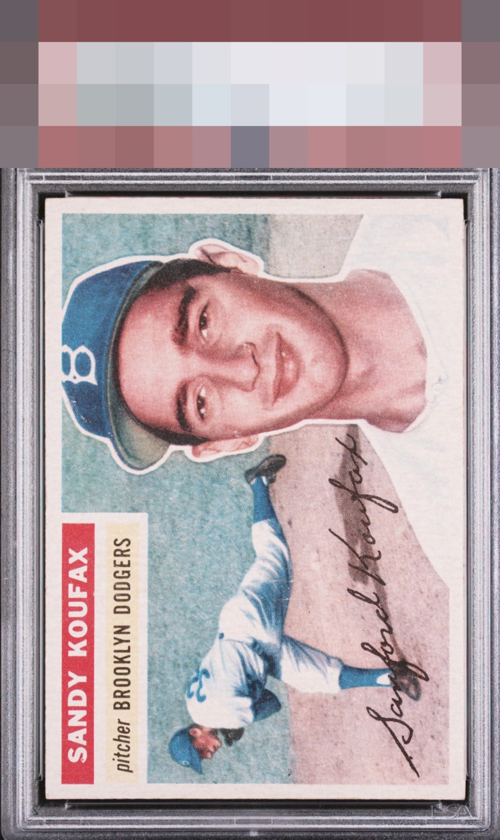
1956 Topps Sandy Koufax #79
1 / 2
Click to enlarge
💬
Reviews & Discussions
7 total reviews

Beautiful card and really well centered. The Color feels a bit washed out which holds it back a bit for me.

Centering is God Tier. The color is a touch faded, some are just printed with a bit of color variance, which keeps eye appeal "only" at the insane A+ level.

i love bright cards but this is overbright and effects the colors and image


This one pleases my eye a great deal. The centering really wins me over on first impression. The color is a bit washed out relative to other examples I've seen. Mild PD is seen but shrugged off easily.

Well-centered. Some light surface wear around the cap and face. Still presents very well.
Locked

0 reviews
EyeQ+
121.0
Global Population
10
POPULATION ACROSS ALL GRADES AND GRADING COMPANIES
Global Eye Rank
#6
Population in Grade
1
POPULATION IN THIS GRADE AND GRADING COMPANY
Eye Rank in Grade
#1
EYEQ+ TROPHY CASE
6th Place
GLOBAL

1st Place
IN-GRADE
📊
Rating Distribution
7 total reviews
G
0%
A+
3 ratings
43%
3
A
1 rating
14%
1
A-
1 rating
14%
1
B+
2 ratings
29%
2
B
0%
B-
0%
C+
0%
C
0%
C-
0%
D+
0%
D
0%
D-
0%
F
0%
Centering really sells this card. Card does seem to have somewhat of a washed out look. Minimal pd is noticed but no real effect on this cards A-tier beauty.