1953 Topps Satchel Paige #220
1 / 2

💬
Reviews & Discussions
5 total reviews

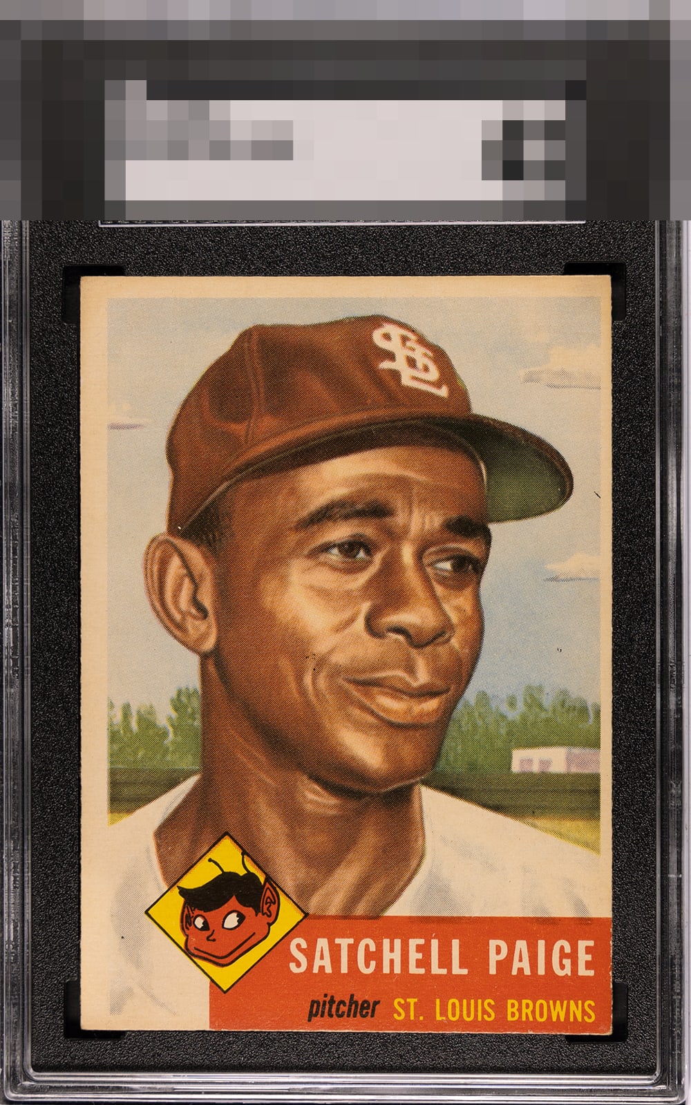
The image looks nice. Centering is the main issue but there is quite a bit of toning and the color has dulled as a result.

Punches high due to image clarity and a great red section. Toning is uniform so my eye is not bothered by it. Corners also strong. As a centering guy, that aspect is what holds the beauty grade to the B Zone for me.

Love the image as it jumps off the page. But the borders, discoloration of the borders, and the off centering of the borders holds it back. Enjoy the card and enjoy the image just leaves you wanting more

5 reviews

0 reviews
EyeQ+
--
Global Population
4
POPULATION ACROSS ALL GRADES AND GRADING COMPANIES
Global Eye Rank
—
No Eye Q+ score
Population in Grade
1
POPULATION IN THIS GRADE ACROSS ALL GRADING COMPANIES
Eye Rank in Grade
—
No Eye Q+ score
EYEQ+ TROPHY CASE

GLOBAL

IN-GRADE
Trophies appear here when earned.
📊
Rating Distribution
5 total reviews
G
0%
A+
0%
A
0%
A-
0%
B+
1 rating
20%
1
B
3 ratings
60%
3
B-
0%
C+
1 rating
20%
1
C
0%
C-
0%
D+
0%
D
0%
D-
0%
F
0%
While the centering is off, it’s well disguised by the light background against the white border. The overall presentation earns a very nice eye appeal score from me.