1954 Topps Ted Williams #1

Reviews & Discussions
10 total reviews

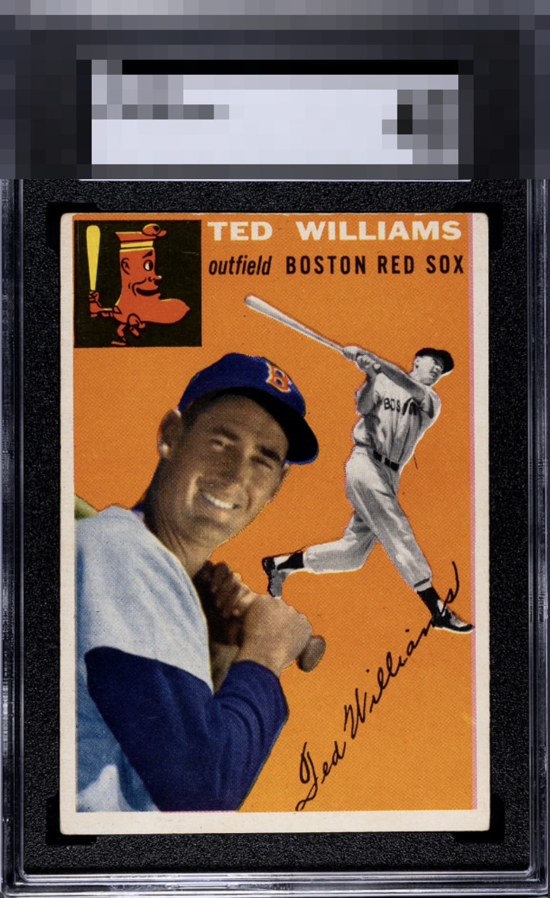
Can’t help but notice the framing push to the left but bright & nice color


The image clarity and focus carry this copy to a strong eye appeal grade. Centering and what look like a bit of surface blemishes keep it out of the A tier.

Love the clear image and nice color on this card. Centering and tilt along with some minor corner wear keep this at a B tier for me.

Centering jumps out as a flaw, but that image also immediately demands appreciation. Registration often wrecks the eye appeal of this card yet this one is the standard for what the image should look like.

Man this image focus is great for this card; registration blur has kept me away from so many copies and this is how I would want one to look. Centering a bit lower would make this easy A or higher for me.

I was leaning B but then the focus really won me over, since so many are out of register. Centering is the main flaw and some top edge wear also grabbed my eye.

nice size borders and nice and clean(most are not this good). The colors and the image are solid

The orange background is pretty clean. A few small blemishes but not really a big deal. Centering is a little high with subtle tilt. Good image of Ted.

EyeQ+
EYEQ+ TROPHY CASE


Rating Distribution
10 total reviews
Centering and some registration issues exist but this still has above average eye appeal.