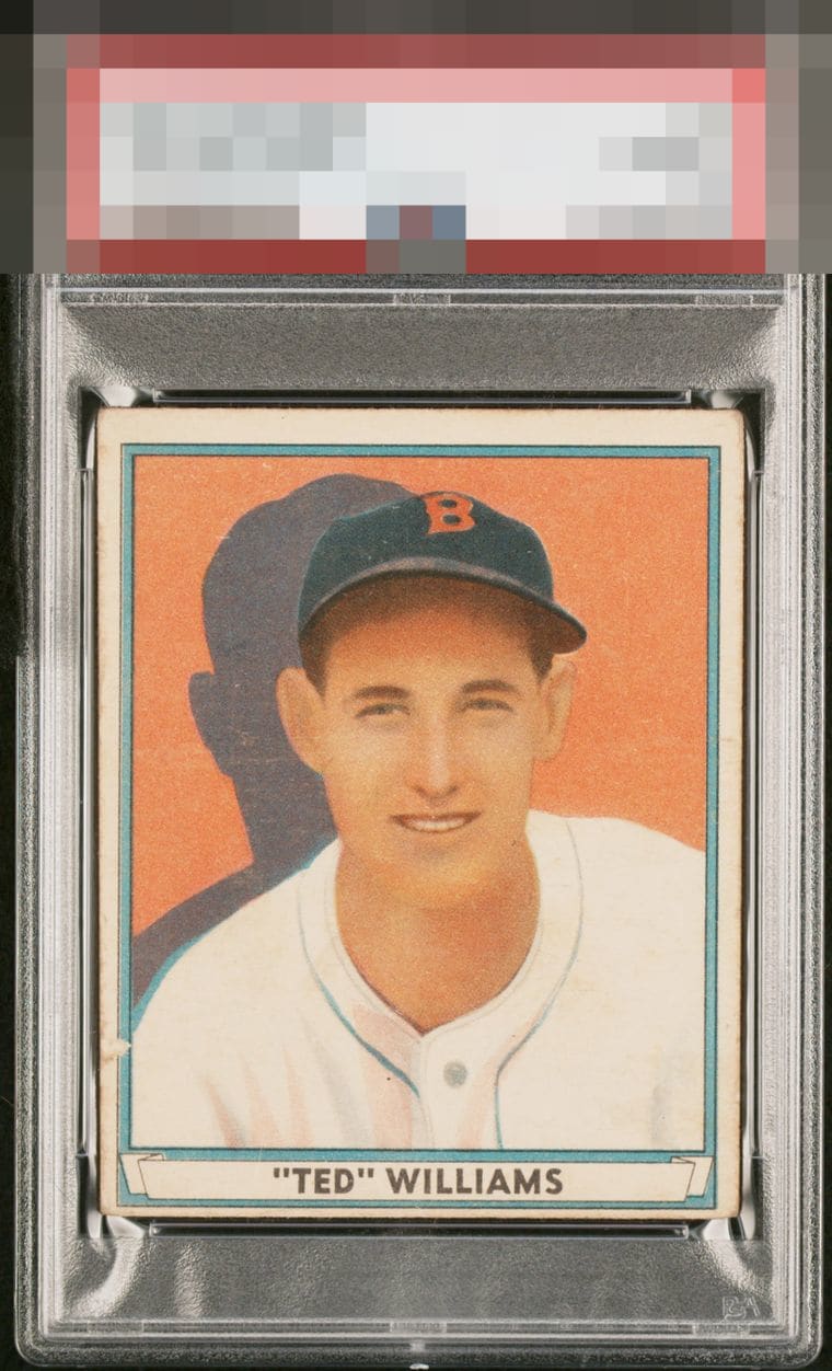
1941 Play Ball Ted Williams #14

Reviews & Discussions
12 total reviews

The clean portrait saves the day here as the low centering and abrasion do grab the eye.

Poor centering, shapeshifting left border and wrinkles (or other surface wear or printing issue) appear to be running through the card from left to right, right through the bridge of his nose. And the little dollop of paper loss on the left border all make this a C- only saved from the D tier by the beautiful image itself.

A bright, saturated image is the key to this card for me. This example is a bit faded. That, plus the centering and slight hiccup on the left border, knock it down a couple of pegs.

Centering could be better but if I have to pick between top/bottom or left/right I take it like this all day long.


This card is deserving of a B grade on color and focus alone. Centering and some surface issues keep it back from the next level for me.

Image being free of major issues nudges this out of the third tier. Centering and that scuff are the main impactors.

Centering and surface issues account for the grade, color and image look nice.

I really like the color, clarity and brightness of the card. Some minor surface wear but they are not noticeable to me unless I get close. The centering and bordering hold it back but overall a nice card
EyeQ+
EYEQ+ TROPHY CASE

Rating Distribution
12 total reviews
Great color on this example but the centering and mark on the left side hold it back.