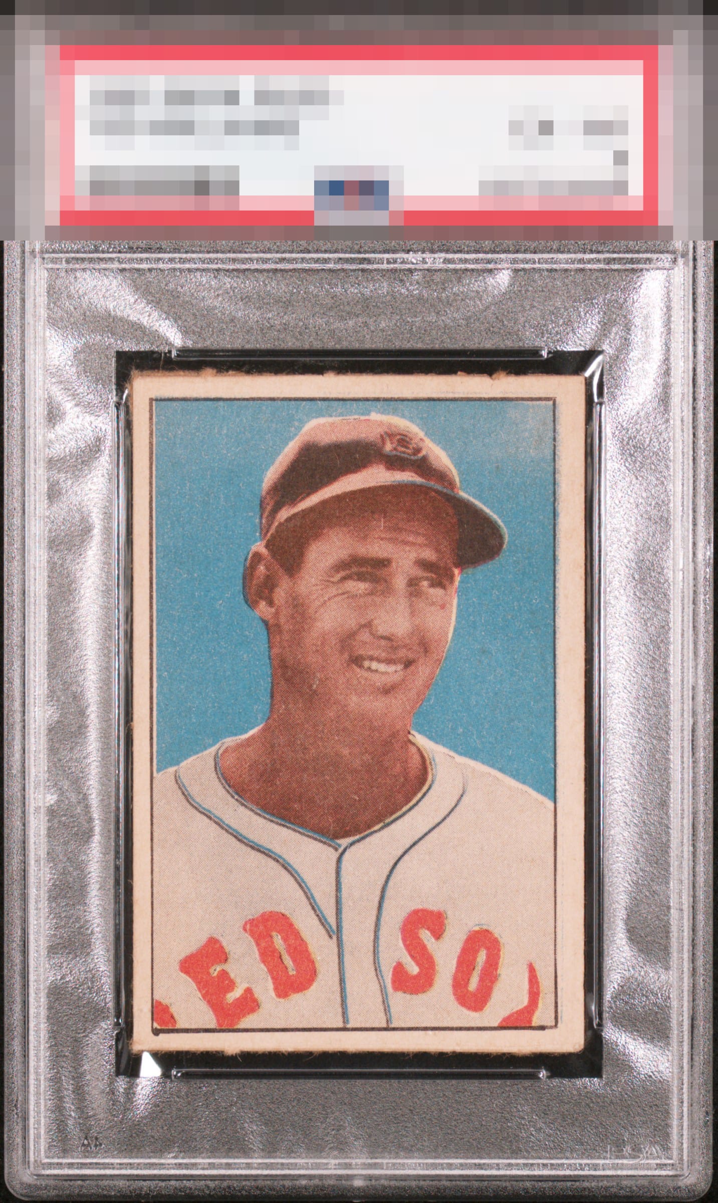
1952 Berk Ross Ted Williams

Reviews & Discussions
8 total reviews

Very nice example of a tough card. Clean, strong reg, good centering.

Centering with slight tilt and top edge is noted with some color and print faintness like most BR cards but a beautiful card .


Very nice image and blue background. Centering is the flaw that bumps my eye followed by the top edge. The image's eye appeal also survives a small registration shift.

A solid looking image. Off-centered L/R. The perforations don't look clean as the paper fibers do draw my eye.

nice looking card that is limited by the L/R centering shift that causes the card to not be framed well. There is surface wear on top especially on the right that affects the look. It is noticeable but it does blend in a bit to be minimized. The colors and image are good
EyeQ+
EYEQ+ TROPHY CASE


Rating Distribution
8 total reviews
Great looking card. Not perfectly centered but these cards are always off centered.