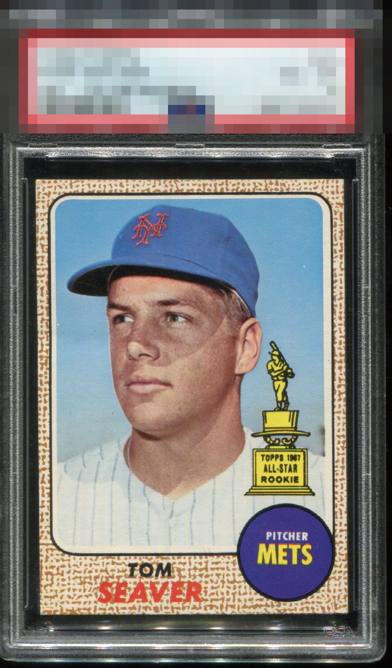
1968 Topps Tom Seaver #45

Reviews & Discussions
14 total reviews

This card is very pretty! Slight shift from R to L centering. Minor edge and corner wear but who cares!! I would be proud to showcase this card in my collection

Sharp corners! From my eye, picture perfect centering. Clear image of Mr. Seaver and another case of a card being wildly under graded. EyeQ+++++

If something is causing this to be a 4 I cannot detect it and could not care less what it is. LOL.

Couple of white dots in the background and a little centering tilt prevent a top two score. But this is a heck of a card!

PSA should be made to pay emotional damages to whoever had to open this from the box and see a 4. Maybe there is a mild bend parallel to his eye on the left near the border, when I enlarge my screen. But I do not see that when viewing my cards in my display. So even if it is TPG-graded accurately, the system is way out of touch.

Nice looking clean card. Nothing POPs but nothing taking away from the card

This is a card you curse PSA when it arrives in the mail after grading.


What the $%& am I missing here? My rule: if I ask that question: GT badge.
EyeQ+
EYEQ+ TROPHY CASE


Rating Distribution
14 total reviews
Looks incredible.