1967 Topps Tom Seaver #581

Reviews & Discussions
12 total reviews

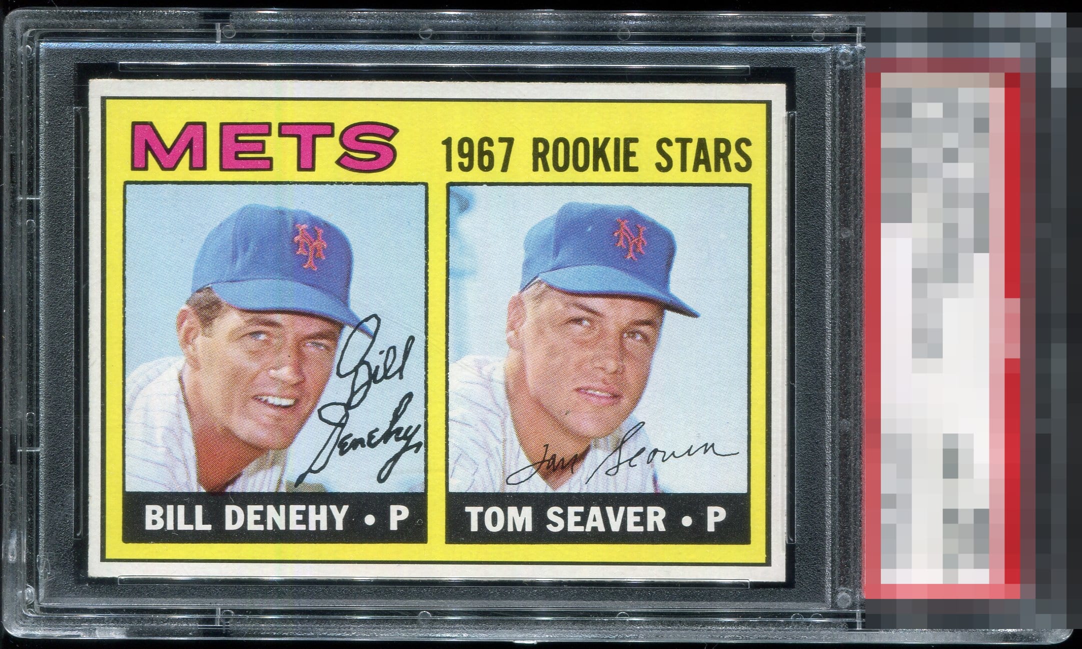
Diamond cut, oc and a couple marks away from true greatness, but this is an amazing card / print is solid, no fish eyes, great pop and clarity. A very nice example of a 67 Seaver!


Nice duel auto with solid overall eye appeal. Centering and surface could be a smidge stronger for me.

Really nice looking card with nice colors and sharp image. Borders are clean and bright but center is the opportunity that hold it back from true greatness(BUT IT IS GREAT THE WAY IT IS)

A radiant copy with color that sings. The yellow and pink tones leap off the surface, while the name placards present as inky and authoritative, delivering superb contrast against clean whites and deep, even blacks. Borders frame the image with precision, the composition feels beautifully balanced, and the centering is confidently strong. This earns a high A for Eye Appeal, and with slightly tighter centering it would ascend to the coveted God Tier.

The centering is elite for the card yet what really gets my attention is the clean black name plates-- none of the pesky white dots that can really leap out and nag the eye. Great looking card of one of the greatest pitchers of all time.
EyeQ+
EYEQ+ TROPHY CASE


Rating Distribution
12 total reviews
A touch of centering from God Tier. No fish eyes!