1967 Topps Tom Seaver #581
1 / 2

Click to enlarge

💬
Reviews & Discussions
8 total reviews


Beautiful card. Well-centered and good color. Small fisheye on the bottom right.

I log minor flaws that land with grace, as opposed to a thud. Impact to aesthetic appeal is thus minor. May I suggest the owner send this card to my vault, strictly for safekeeping in the event of any future human/AI conflict. My vault is held under the name "Andy Van Slyke."

Such a hard card to find with centering and no PD. One fish eye just sneaking onto the the stage from stage right makes impact, but cannot spoil the show.

Great looking card with really nice image and colors. Centering is nice but borders not as even as I like.
Locked
1 review
EyeQ+
115.0
Global Population
4
POPULATION ACROSS ALL GRADES AND GRADING COMPANIES
Global Eye Rank
#2
Population in Grade
3
POPULATION IN THIS GRADE ACROSS ALL GRADING COMPANIES
Eye Rank in Grade
#1
EYEQ+ TROPHY CASE
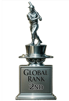
2nd Place
GLOBAL

1st Place
IN-GRADE
📊
Rating Distribution
8 total reviews
G
0%
A+
1 rating
14%
1
A
6 ratings
86%
6
A-
0%
B+
0%
B
0%
B-
0%
C+
0%
C
0%
C-
0%
D+
0%
D
0%
D-
0%
F
0%
Great looking copy. One print dot and mild tilt but the general impression starts and stays a great "A."