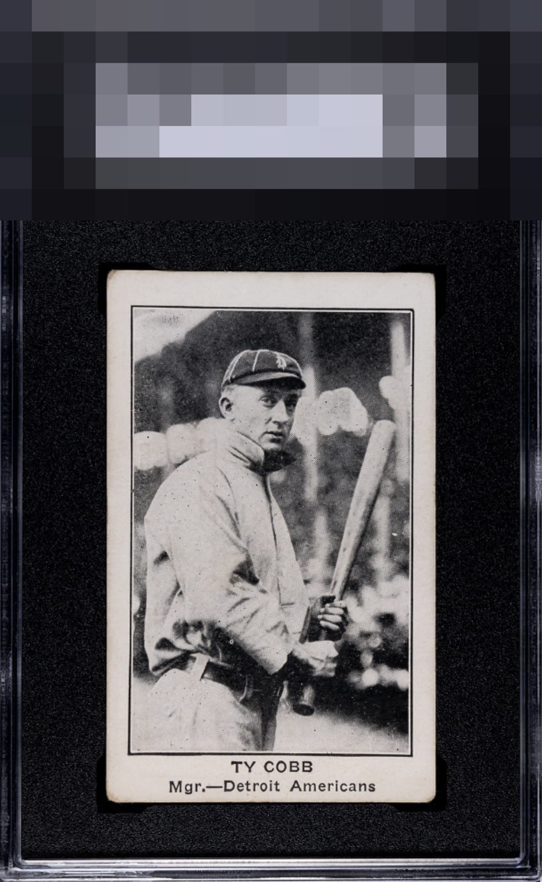
1922 American Caramel Ty Cobb

Reviews & Discussions
5 total reviews

Cards like this I lock away in my display forever. Front presents great, centering is nearly dead nuts, no problems in the image, just organic corner wear. As it says in my Grading Style, backs do not really faze me especially where the back has no stats or cartoon or bio.

Love this! Centering and image are A+! Corner wear is all I see and the back is whatever to me.

the card has nice size borders but they are off center and cause a noticeable tilt. there is alot of surface wear/speckling that effects the overall look. But it being a black and white it mostly blends in. the main image is nice and provides nice contrast. A Card to enjoy

Classic image of Cobb. A touch low in the centering and some small dark specks on the uniform and background. Doesn't detract too much but noticeable. Overall, a beautiful pleasing card that's over 100 years old.

EyeQ+
EYEQ+ TROPHY CASE


Rating Distribution
5 total reviews
Obvious corner fuzz & slight shift but the card remains super strong with a great image & bold print