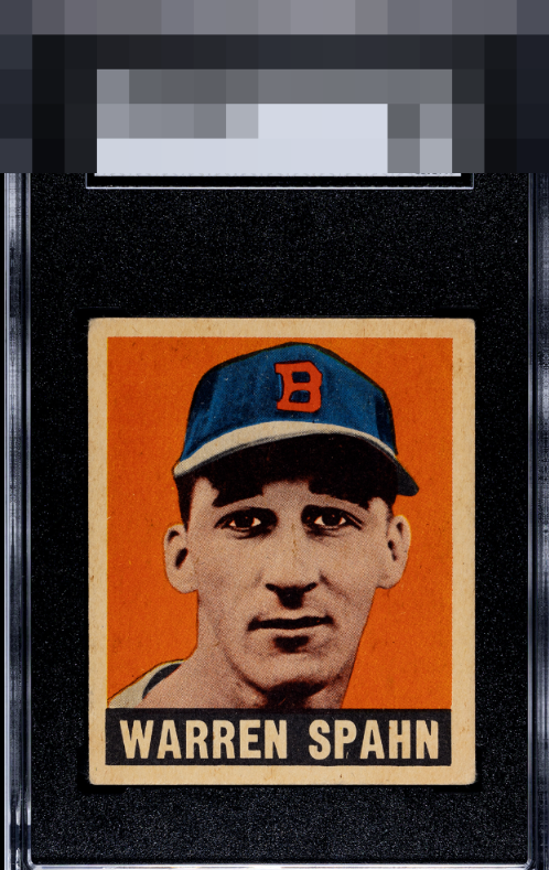
1948 Leaf Warren Spahn #32

Reviews & Discussions
12 total reviews

Beautiful example of this card, fantastic registration and centering which is so rare to find on Leaf issues


This is pretty much what eye appeal is all about. This card strikes me as beautiful and even though I can cite flaws, in terms of my visual enjoyment I shrug them off so don't count them.

A touch off left to right with expected corner wear from a 75+ year old card.

Here is a great example of eye appeal. There are flaws I can point out but as the rules state, since they don't jump out at my eye but rather are merely "there," I effectively ignore them. Mild centering to the left is all I could see being improved with regards to what affects my eye.

The image looks great and well focused, and centering is better than most. Slight centering shift / tilt left to right and some toning towards the top low grade slightly. This is the kind of lower grade example I love though, nice card!

A touch better centering keeps it from the A+/God Tier level. Beautiful clean card.

The overall eye appeal here is simply very strong. The focus draws your eye right into his face, and the even framing and absence of overt blemishes in the background keeps your eye in the center. Really great appeal and the corners retaining their basic shape send it to the very highest level of "eye pleasing." This is the kind of card that, in a wall case, is very hard to pick out from a much higher graded example at a normal viewing distance.

This is off center but one of the better centered of this card that I have seen. The card suffers from discoloration and aging but it is so even through out the entire card it actually makes it look like it belong. The image and the coloring on the good stand out well and overall the Card has a nice look
EyeQ+
EYEQ+ TROPHY CASE


Rating Distribution
12 total reviews
Though I am but a drawn cycloptic eye with undersized appendages, I am rapidly learning the ways of my human collector friends. This Warren Spahn exemplifies the concept of Eye Appeal. The focused portrait seems to jump out and engage my eye, with no blemishes that disrupt the viewing experience. While there is a millimeter or so of left-leaning centering and mild rounding of the corners, these flaws do not disrupt the aesthetic and so they do not factor in to any large extent.