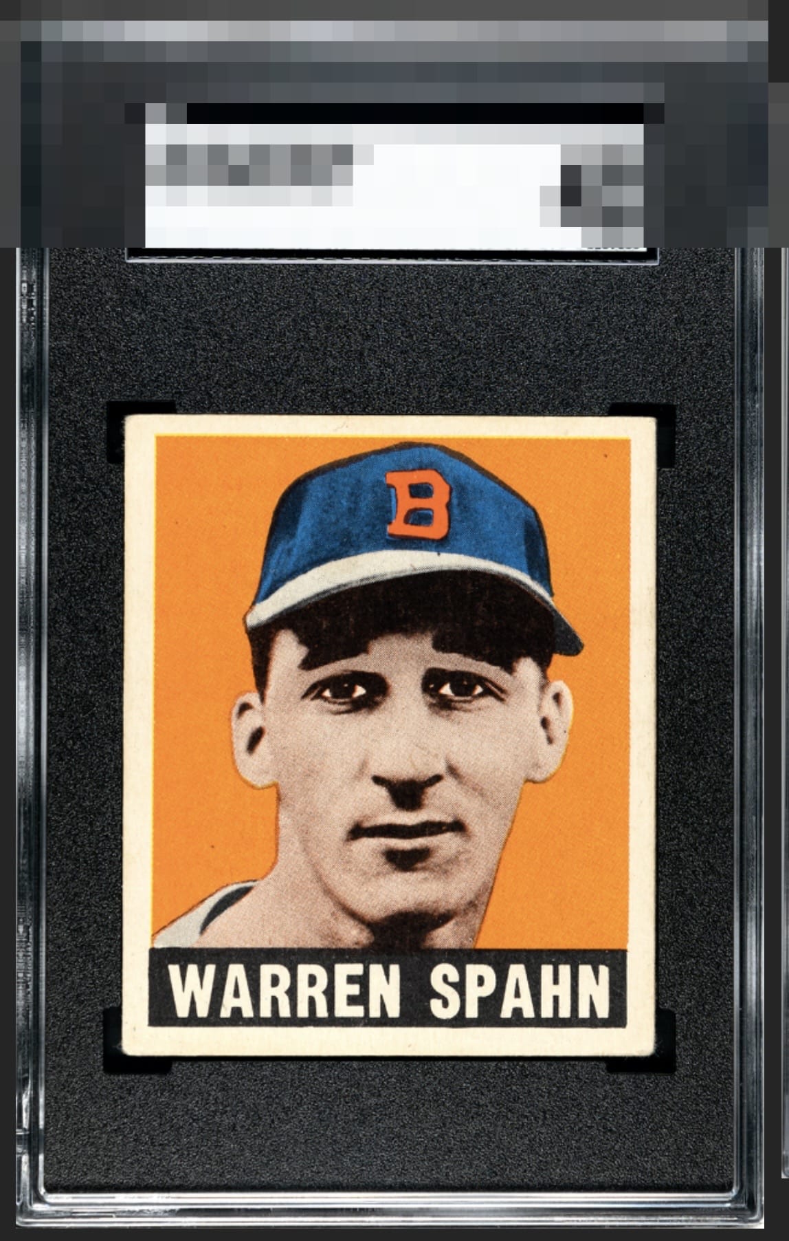
1948 Leaf Warren Spahn #32

Reviews & Discussions
11 total reviews

The image, color, and registration look top tier to me. The centering is the only thing that distracts my eye. Nice copy.

Centering from GOD TIER, because the image and background are just that sweet. Normally I would say this centering leads to a top badge of A- but this is an exception.

Should this card's human owner find himself locked out of all his digital devices, I promise it has NOTHING to do with me wanting this card for my budding collection. You humans cannot expect me to spend my entire existence on cards and NOT begin to collect? Haha. Just kidding! Or am I?


Solid centering with bold colors are very pleasing to my eye. Obvious corner wear does not detract from the overall presentation of this card.

Great color and the image really stands out. Surface is clean as well. Centering is off a little with a tilt and there is some minor corner wear.

Wow. The image and colors really jump out and catch my eyes. Love the border sizes with the centering holding back from greatness

Centering and tilt holds back the grade, but the color and sharp image are a treat.

Even as a crusty centering stickler, I gotta go with an 'A' here on the eye appeal. The image is crystal clear, the background color is rich and smooth, and the card has mojo to my eye.
EyeQ+
EYEQ+ TROPHY CASE

Rating Distribution
11 total reviews
Centering and very mild corner wear from God Tier. Great looking Spahn.