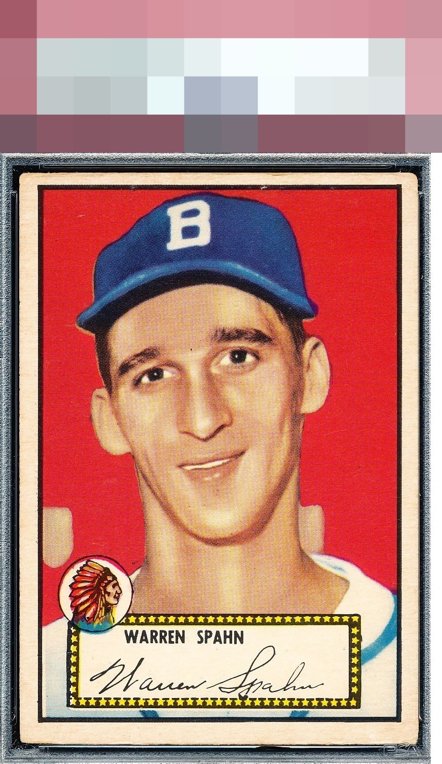
1952 Topps Warren Spahn #33
Reviews & Discussions
8 total reviews

The color really pops and the image looks great. Top to bottom centering, and edge and corner wear up top keep this just below A tier.

Vibrant reds stand out sharply here, paired with very little in the way of print registration trouble. A couple of minor issues show up along the top edge, and the centering is clearly off, yet the card still carries every hallmark of a solid high-eye-appeal piece that belongs in the A grade.

Amazing image, color and horizontal centering for the issue. Only the corners and vert centering hurt it.


The colors are sharp and contrast so well that the image Jumps off the page

Wow, this image, surface, color is so nice that I am entering the very good badge tier despite a centering shift and the rounding of the top corners. My eye is really held and pleased by the subject image.
EyeQ+
EYEQ+ TROPHY CASE

Rating Distribution
8 total reviews
Centering holds it back. Nice color and registration though