1956 Topps Willie Mays #130
1 / 2

Click to enlarge

💬
Reviews & Discussions
8 total reviews


like the card and solid image and colors but the centering is off and affects how the card is framed and looks

Colors and surface look very nice. Centering is good but is shifted to the bottom right. No major flaws.

Only centering bumps my eye on this Say Hey Kid. The rest is very enjoyable.

Slight shift Left and Top are noted first. Honest corners and tiny print dots near the blue box and his neck have little impact on wonderful eye appeal. Nice example of the Say Hey Kid.
Locked
1 review
EyeQ+
115.0
Global Population
7
POPULATION ACROSS ALL GRADES AND GRADING COMPANIES
Global Eye Rank
#6
Population in Grade
1
POPULATION IN THIS GRADE ACROSS ALL GRADING COMPANIES
Eye Rank in Grade
#1
EYEQ+ TROPHY CASE
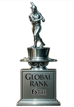
6th Place
GLOBAL

1st Place
IN-GRADE
📊
Rating Distribution
8 total reviews
G
0%
A+
0%
A
1 rating
14%
1
A-
2 ratings
29%
2
B+
4 ratings
57%
4
B
0%
B-
0%
C+
0%
C
0%
C-
0%
D+
0%
D
0%
D-
0%
F
0%
Solid looking 56 Mays. Centering is off enough to distract my eyes. A little bit of print issue in the neck area also draws my eye but does overpower in a negative way.