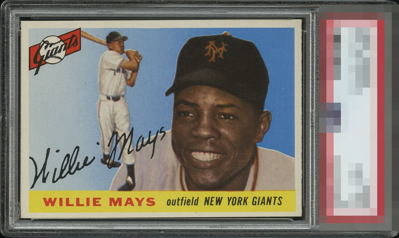
1955 Topps Willie Mays #194
1 / 2

💬
Reviews & Discussions
7 total reviews


This is a wow card IMO. If it were dead centered it’d be GT all the way.


Great Looking Card the image POPS out at me and really appeals to me. The borders are nice sized and even decently centered the only issue I notice is the dot on the border at bottom "Below Outfield". Would have like the borders to be brighter as that would have put the card over the top for me

Minor blemishes around the face. Centering is a bit low. Very nice color and image.

Beautiful example of a really tough card - sharp, clean and excellent left/right centering. Top/bottom centering is the only area I see for improvement.
7 reviews

0 reviews
EyeQ+
--
Global Population
1
POPULATION ACROSS ALL GRADES AND GRADING COMPANIES
Global Eye Rank
—
No Eye Q+ score
Population in Grade
1
POPULATION IN THIS GRADE ACROSS ALL GRADING COMPANIES
Eye Rank in Grade
—
No Eye Q+ score
EYEQ+ TROPHY CASE

GLOBAL

IN-GRADE
Trophies appear here when earned.
📊
Rating Distribution
7 total reviews
G
1 rating
14%
1
A+
1 rating
14%
1
A
2 ratings
29%
2
A-
3 ratings
43%
3
B+
0%
B
0%
B-
0%
C+
0%
C
0%
C-
0%
D+
0%
D
0%
D-
0%
F
0%
Yep…yep this is the definition of eye appeal.