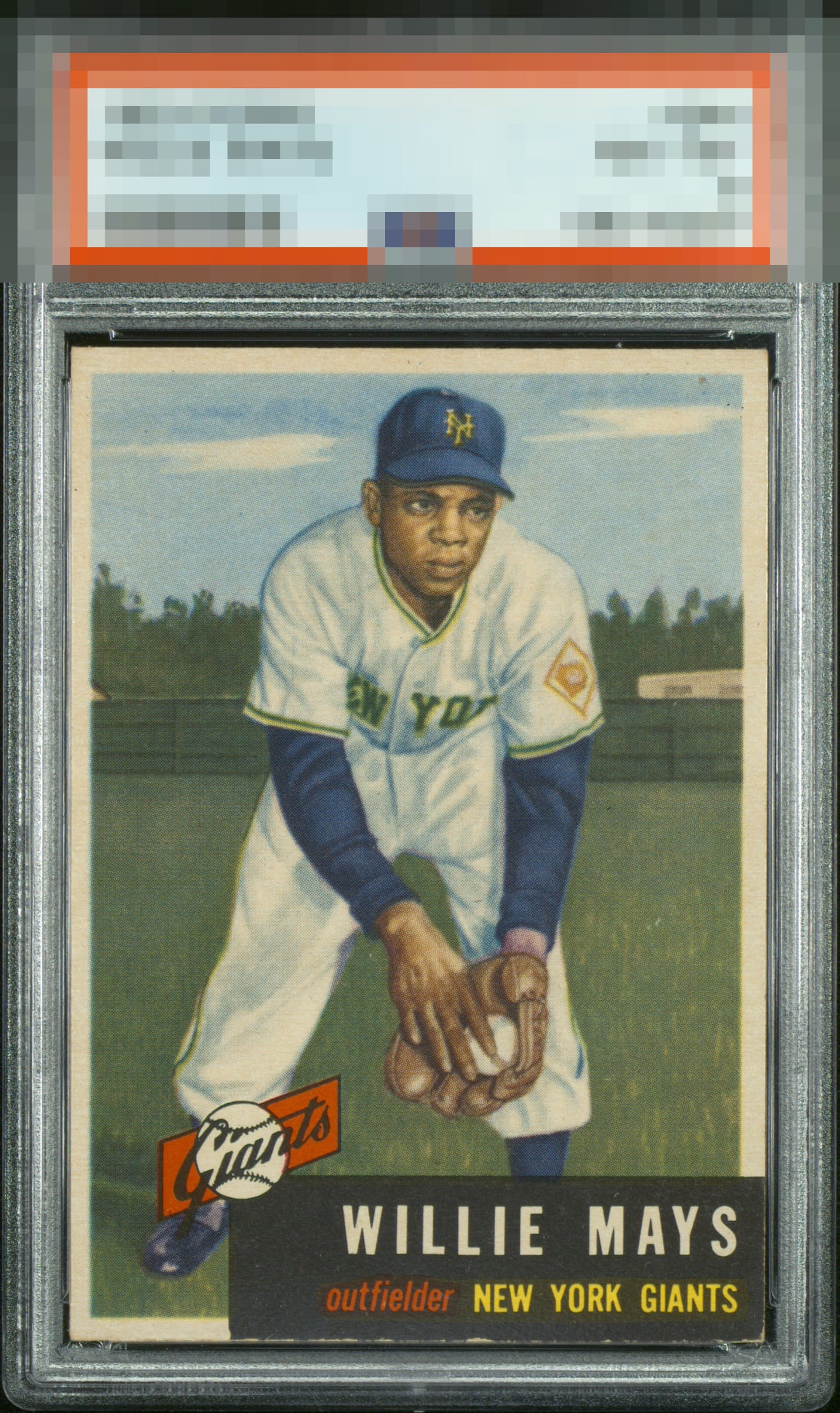
1953 Topps Willie Mays #244

Reviews & Discussions
11 total reviews

A work of art to begin with, plus sharp and really nicely centered. A click washed out and that key bottom right corner are the only little flaws. But that corner is key for 53 Topps.

Highest tier eye appeal with slight side centering and mild black edge chipping being the only flaws-- and they do not amount to much eye appeal wise.

Not much to complain about here. The slight toning is all that drops it a tiny bit for me.

Nice color and image. Slight centering shift and some edge chipping on the bottom are minor issues. Looks better than most of these I've seen.

Love the look here and centering with a little more color depth would get it past the velvet rope to GT.

Strong overall eye appeal. Black nameplate and a bit more “punch” in the color away from the A tier for me.

Amazing example, with just a few very slight areas for improvement.

Nice looking card. Strong colors and image and the borders are nice size The opportunity is the borders not as bright from aging and the bottom black being nicked up stands out

Digging this card, the chipped black bottom edge is the only eye appeal drawback-- as is the case for the colored name box of all 53 Topps specimens.
EyeQ+
EYEQ+ TROPHY CASE


Rating Distribution
11 total reviews
High eye appeal for a 53T Mays, which is a card I doubt we'll see often get A- or higher on overall appeal. This example is a breath from A or even higher to me, were the centering a tap better or the black corner and edge better preserved. And that last aspect is asking a shit ton for any 53T.