1952 Topps Willie Mays #261
1 / 2

💬
Reviews & Discussions
6 total reviews


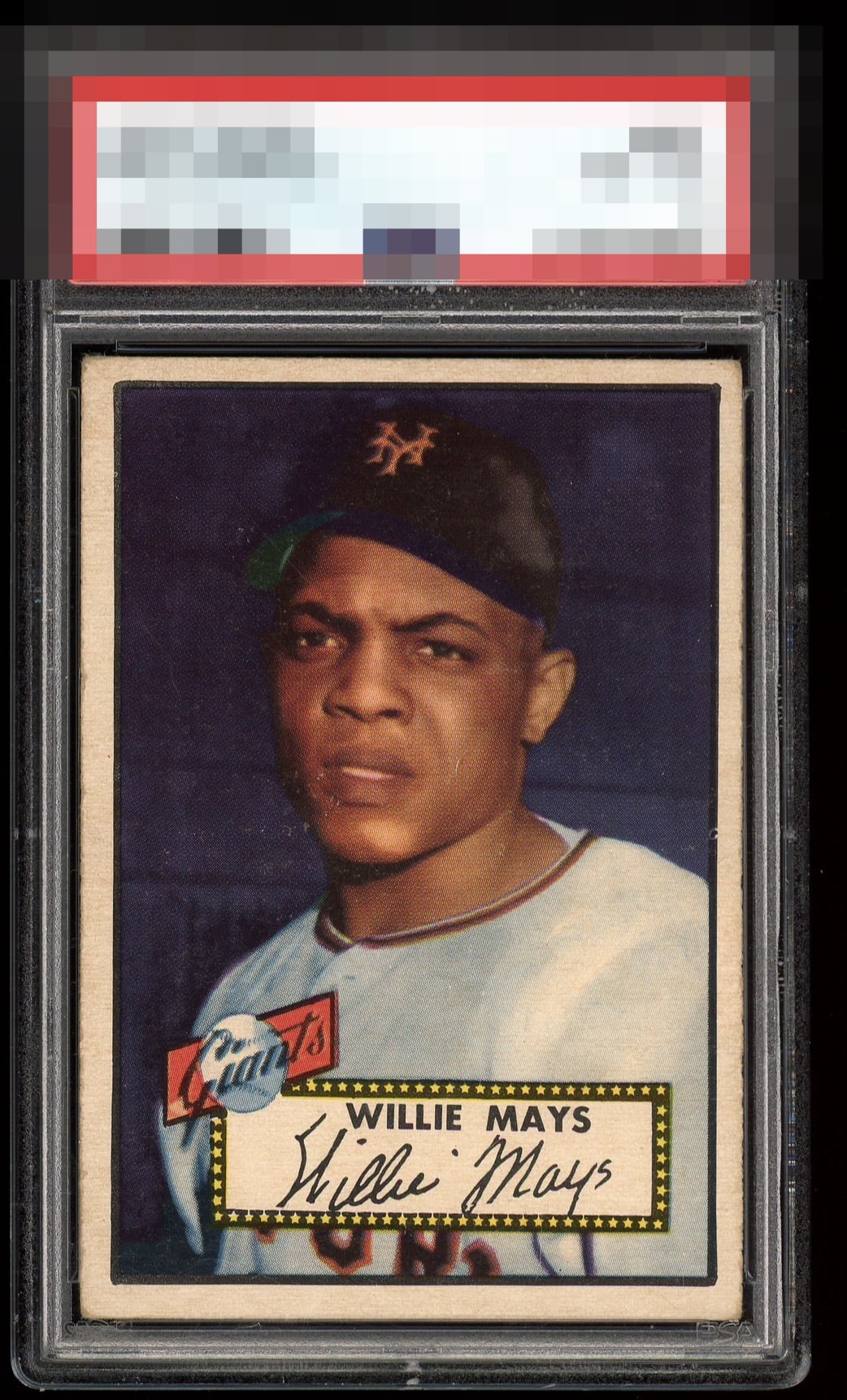
While centering is usually my number one focus, for certain cards there are key features that trump all. When looking at a 1952 Mays I key in on that deep purple background. This on grabs me and boosts what would normally be limited to a B based on centering.

Nice image and the background color looks good. The centering is off with a tilt and the surface wear distracts a little. Still presents well.

Pretty solid! Just a bit of snow, which drifts over is his face along with a slight centering opportunity.
6 reviews

0 reviews
EyeQ+
--
Global Population
35
POPULATION ACROSS ALL GRADES AND GRADING COMPANIES
Global Eye Rank
—
No Eye Q+ score
Population in Grade
13
POPULATION IN THIS GRADE ACROSS ALL GRADING COMPANIES
Eye Rank in Grade
—
No Eye Q+ score
EYEQ+ TROPHY CASE

GLOBAL

IN-GRADE
Trophies appear here when earned.
📊
Rating Distribution
6 total reviews
G
0%
A+
0%
A
0%
A-
0%
B+
2 ratings
33%
2
B
3 ratings
50%
3
B-
1 rating
17%
1
C+
0%
C
0%
C-
0%
D+
0%
D
0%
D-
0%
F
0%
I really like the look of this card and I do like the size of the borders. wish the centering was better but because the image is mostly on the right it actually balances it to my eyes. The colors and image are nice just some background snow that mostly blends in